Friday, December 25, 2015

Fast food studies


Season's greetings.

For your Christmas reading, this blog usually provides a seasonally appropriate post on fast food, including to date posts about: nutrition (McDonald's fast-food), geography (Fast-food maps) and diet (Fast food and diet). This year, we will update some of the geographical and diet information about the effects of fast food on people worldwide.

First, there seems to be a general perception that access to fast food is continuing to increase in the modern world, even though that increase started more than half a century ago. Such a perception is easy to verify in the USA, as shown in a previous post (Fast-food maps). However, this trend also appears globally.

For example, in 2013 the Guardian newspaper produced a dataset (called the McMap of the World) illustrating the recent growth in the number of McDonald's restaurants worldwide (McDonald's 34,492 restaurants: where are they?). This first graph shows the relative number of restaurants in 2007 and 2012, with each dot representing a single country. Almost all of the 116 countries showed an increase during the five years (ie. their dots are above the pink line). The only country with a major decrease in McDonald's restaurants was Greece (to the right of the pink line), due, no doubt, to its ongoing financial problems. The country with the largest number of restaurants is, of course, the USA, with Japan a clear second.


There is also a perception that fast-food restaurants compete for customers against other types of restaurants, so that suburbs can have one or the other but not both. This can be checked using the data in the Food Environment Atlas 2014 (produced by the USDA Economic Research Service), which show the number of both Fast-food and Full-service restaurants / 1,000 popele in 2012 for each of the more than 3,100 counties in the USA. This is illustrated in the next graph, where each dot represents a single county.


For most counties, full-service restaurants actually out-number fast-food restaurants, per capita. There are even a few counties that have no fast-food places at all, but also a few with no full-service restaurants. There are even a few with neither restaurant type, notably in AK (2 counties), KY and ND. Interestingly, 3 out of the 4 counties with the largest density of full-service restaurants are in CO (including one not shown because it is off the top of the graph).

Nevertheless, you can't go far in the USA without encountering a fast-food place. As shown in a previous post (Fast-food maps), Subway has the largest number of establishments, not McDonald's. The Flowing Data blog has recently compiled a couple of maps showing the dominance of Subway in the sandwich business (Where Subway dominates its sandwich place competition, basically everywhere). This map shows the subway dominance — each dot is an area with a 10-mile radius, colored by the brand of the nearest sandwich chain.

Unfortunately, studying the effects of geography on access to fast food is not as simple as it might seem. Large-scale patterns such as those shown above are only part of the picture, because access to fast food is usually assumed to be determined at a very local scale — how far from you is the nearest fast-food place, and how easy is it to get there?

There have been many studies over the years, based on different methods and with different study criteria. These have been summarized (from different perspectives) by SE Fleischhacker, KR Evenson, DA Rodriguez, AS Ammerman (2010. A systematic review of fast food access studies. Obesity Reviews 12: e460) and LK Fraser, KL Edwards, J Cade, GP Clarke (2010. The geography of fast food outlets: a review. International Journal of Environmental Research and Public Health 7: 2290-2308).

Their conclusions from their worldwide literature reviews include:
  • most studies indicated fast-food restaurants were more prevalent in low-income areas compared with middle- to higher-income areas (ie. there is a positive association between availability of fast-food outlets and increasing socio-economic deprivation);
  • most studies found that fast food restaurants were more prevalent in areas with higher concentrations of ethnic minority groups;
  • those studies that included overweight or obesity data (usually measured as the body mass index) showed conflicting results between obesity / overweight and fast-food outlet availability — most studies found that higher body mass index was associated with living in areas with increased exposure to fast food, but the remaining studies did not find any such association;
  • there is some evidence that fast food availability is associated with lower fruit and vegetable intake.
In a previous post (Fast food and diet) I illustrated the association between fast food and obesity in the USA. Here, I use the data from the Guardian article mentioned above (McMap of the World) to do the same thing at a global scale. This next graph shows the relationship between the per capita density of McDonald's restaurants and overweight / obesity for those countries for which there are data available (each dot represents a single country).


These patterns have continued over the five years since the reviews appeared, with published studies both pro (eg. J Currie, S DellaVigna, E Moretti, V Pathania. 2010. The effect of fast food restaurants on obesity and weight gain. American Economic Journal: Economic Policy 2: 32-63) and con (AS Richardson, J Boone-Heinonen, BM Popkin, P Gordon-Larsen. 2011. Neighborhood fast food restaurants and fast food consumption: a national study. BMC Public Health 11: 543) the association between fast food availability and health. To them has been added the issue of Type II diabetes and fast-food consumption (see DH Bodicoat et al. 2014. Is the number of fast-food outlets in the neighbourhood related to screen-detected type 2 diabetes mellitus and associated risk factors? Public Health Nutrition 18 : 1698-1705).

Moving on, people have also considered how the role of restaurants might define the identity of American cities. For example, Zachary Paul Neal has considered whether US cities can be classified on the basis of the local prevalence of specific types of restaurants (2006. Culinary deserts, gastronomic oases: a classification of US cities. Urban Studies 43: 1-21). He counted the numbers of several different types of restaurants in 243 of the most populous cities in the USA, and ended up classifying them into four distinct city types: Urbane oases (where one finds an abundance of restaurants of all sorts), McCulture oases (which have larger than normal concentrations of "highly standardised eating places designed for mass consumption"), Urbane deserts and McCulture deserts (both of which have fewer restaurants than their respective oasis counterpart).

Unfortunately, this sort of classification approach is self-fulfilling, because any mathematical grouping algorithm will form groups, by definition, even if there are no groups in the data. I have shown this a number of times in this blog (eg. Network analysis of scotch whiskies; Single-malt scotch whiskies — a network). These culinary data are thus crying out for a network analysis, and I would normally present one at this point in the blog post. However, I do not have a copy of Neal's dataset.

So, instead, I will finish by analyzing some data on the salt content of fast food (E Dunford et al. 2012. The variability of reported salt levels in fast foods across six countries: opportunities for salt reduction. Canadian Medical Association Journal 184: 1023-1028).

The authors collected data on the salt content of products served by six fast food chains that operate in Australia, Canada, France, New Zealand, the United Kingdom and the United States — Burger King, Domino’s Pizza, Kentucky Fried Chicken, McDonald’s, Pizza Hut and Subway. The product categories included: savoury breakfast items, burgers, chicken products, french fries, pizza, salads, and sandwiches. Data were collated for all of the products provided by all of the companies that fitted into these categories (137-523 products per country). Mean salt contents and their ranges were calculated, and compared within and between countries and companies.

We can use a phylogenetic network to visualize these data. As usual, I have used the manhattan distance and a neighbor-net network. The result is shown in the next figure. Countries that are closely connected in the network are similar to each other based on their fast-food salt content, and those that are further apart are progressively more different from each other.


You will note that the North American countries are on one side of the network, with the highest salt content, while the European countries are on the other, with the lowest salt content (on average 85% of the American salt content). This difference was reflected even between the same products in different countries — for example, McDonald's Chicken McNuggets contained 0.6 g of salt per 100 g in the UK but 1.6 g of salt per 100 g in the USA). As the authors note: "the marked differences in salt content of very similar products suggest that technical reasons are not a primary explanation."

Thursday, December 17, 2015

Is the Ring of Life a network?


Ten years ago, Rivera and Lake decided to emphasize the series if genome fusions that seem to have been involved in the origin of the major phylogenetic groups by calling it the ring of Life rather than the Tree of Life:
Maria C. Rivera and James A. Lake. 2004. The Ring of Life provides evidence for a genome fusion origin of eukaryotes. Nature 431: 182-185).

This terminology has been repeated in a number of subsequent papers, including:
James McInerney, Davide Pisani and Mary J. O'Connell (2015) The Ring of Life hypothesis for eukaryote origins is supported by multiple kinds of data. Philosophical Transactions of the Royal Society of London B 370: 20140323.
However, life is not that simple, and it has more recently become accepted that a set of inter-connected rings is involved in the metaphor, rather than the simple ring originally presented. Thus we now have the plural Rings of Life, instead.

James A. Lake and Janet S. Sinsheimer (2013) The deep roots of the Rings of Life. Genome Biology and Evolution 5: 2440-2448.
James A. Lake, Joseph Larsen, Brooke Sarna, Rafael R. de la Haba, Yiyi Pu, HyunMin Koo, Jun Zhao and Janet S. Sinsheimer (2016) Rings reconcile genotypic and phenotypic evolution within the Proteobacteria. Genome Biology and Evolution (in press).
I think that the rest of us would still call each of these diagrams a network. Indeed, most of the metaphors that have been used over the years can also be called a network (see Metaphors for evolutionary relationships).

Wednesday, December 9, 2015

Lexicostatistics: the predecessor of phylogenetic analyses in historical linguistics


Phylogenetic approaches in historical linguistics are extremely common nowadays. Especially, probabilistic models that model lexical change as a birth-death process of cognate sets evolving along a phylogenetic tree (Pagel 2009) are very popular (Lee and Hasegawa 2011, Kitchen et al. 2009, Bowern and Atkinson 2012), but also splits networks are frequently used (Ben Hamed 2005, Heggarty et al. 2010).

However, the standard procedure to produce a family tree or network with phylogenetic software in linguistics goes back to the method of lexicostatistics, which was developed in the 1950s by Morris Swadesh (1909-1967) in a series of papers (Swadesh 1950, 1952, 1955). Lexicostatistics was discarded by the linguistic community not long after it was proposed (Hoijer 1956, Bergsland and Vogt 1962). Since then, lexicostatistics is considered a methodus non gratus in classical circles of historical linguistics, and using it openly may drastically downgrade one's perceived credibility in certain parts of the community.

To avoid the conflicts, most linguists practicing modern phylogenetic approaches emphasize the fundamental differences between early lexicostatistics and modern phylogenetics. These differences, however, apply only to the way the data is analysed. The basic assumptions underlying the selection and preparation of data have not changed since the 1950s, and it is important to keep this in mind, especially when searching for appropriate phylogenetic models to analyse the data.

The Theory of Basic Vocabulary

Swadesh's basic idea was that in the lexicon of every human language there are words that are culturally neutral and functionally universal; and he used the term "basic vocabulary" to refer to these words. Culturally neutral hereby means that the meanings expressed by the words are independently used across different cultures. Functional universality means that the meanings are expressed by all human languages independent of the time and place where they are spoken. The idea is that these meanings are so important for the functioning of a language as a tool of communication, that every language needs to express them.

Cultural neutrality and functional universality guarantee two important aspects of basic words: their stability and their resistance to borrowing. Stability means that words expressing a basic concept are less likely to change their meaning or to be replaced by another word. An argument for this claim is the functional importance of the words — if the words are important for the functioning of a language, it would not make much sense to change them too quickly. Humans are good at changing the meanings of words, as we can see from daily conversations in the media, where new words tend to pop up seemingly on a daily basis, and old words often drastically change their meanings. But changing words that express basic meanings like "head", "stone", "foot", or "mountain" too often might give rise to confusion in communication. As a result, one can assume that words change at a different pace, depending on the meaning they express, and this is one of the core claims of lexicostatistics.

Resistance to borrowing follows also from stability, since the replacement of words expressing basic meanings may again have an impact on our daily communication, and we may thus assume that speakers avoid borrowing these words too quickly. Cultural neutrality of concepts is another important point to guarantee resistance to borrowing. Words expressing concepts which play an important cultural role may easily be transferred from one language to another along with the culture. Thus, although it seems likely that every language has a word for "god" or "spirit" and the like (so the concept is to a certain degree functionally universal), the lack of cultural independency makes words expressing religious terms very likely candidates for borrowing, and it is probably no coincidence that words expressing religion and belief rank first in the scale of borrowability (Tadmor 2009: 232).

Lexical Replacement, Data Preparation, and Divergence Time Estimation

Swadesh had further ideas regarding the importance of basic vocabulary. He assumed that the process of lexical replacement follows universal rates as far as the basic vocabulary is concerned, and that this would allow us to date the divergence of languages, provided we are able to identify the shared cognates. In lexical replacement, a word w₁ expressing a given meaning x in a language is replaced by a word w₂ which then expresses the meaning x, while w₁ either shifts to express another meaning, or completely disappears from the language. For example, older thou did in English was replaced by the plural form you, which now also expresses the singular. In order to search for cognates and determine the time when two languages diverged, Swadesh proposed a straightforward procedure, consisting of very concrete steps (compare Dyen et al. 1992):
  • Compile a list of basic concepts (concepts that you think are culturally neutral and functionally universal; see here for a comparative collection of different lists that have been proposed and used in the past)
  • translate these concepts into the different languages you want to analyse
  • search for cognates between the languages in each meaning slot; if words in two languages are not cognate for a given meaning, then this points to former processes of lexical replacement in at least one of the languages since their divergence
  • count the number of shared cognates, and use some mathematics to calculate the divergence time (which has been independently calibrated using some test cases of known divergence times).
As an example for such a wordlist with cognate judgments, compare the table in the first figure, where I have entered just a few basic concepts from Swadesh's standard concept list and translated them into four languages. Cognacy is assigned with help of IDs in the column at the right of each language column, but also further highlighted with different colors.

Classical cognate coding in lexicostatistics

Phylogenetic Approaches in Historical Linguistics

Modern phylogenetic approaches in historical linguistics basically follow the same workflow that Swadesh propagated for lexicostatistics, the only difference being the last step of the working procedure. Instead of Swadesh's formula, which compared lexical replacement with radioactive decay and was based on aggregated distances in its core, character-based methods are used to infer phylogenetic trees. Characters are retrieved from the data by extracting each cognate from a lexicostatistical wordlist and annotating the presence or absence of each cognate set in each language.

Thus, while Swadesh's lexicostatistical data model would state that the words for "hand" in German and English were cognate, and also in Italian and French, but not in Germanic and Romance, the binary presence-absence coding states that the cognate set formed by words like English hand and German Hand is not present in Romance languages, and that the cognate set formed by words like Italian mano and French main is absent in Germanic languages. This is illustrated in the table below, where the same IDs and colors are used to mark the cognate sets as in the table shown above.

Presence-absence cognate coding for modern phylogenetic analyses

The new way of cognate coding along with the use of phylogenetic software methods has brought, without doubt, many improvements compared to Swadesh's idea of dating divergence times by counting percentages of shared cognates. A couple of problems, however, remain, and one should not forget them when applying computational methods to originally lexicostatistic datasets.

First, we could ask whether the main assumptions of functional universality and cultural neutrality really hold. It seems to be true that words can be remarkably stable throughout the history of a language family. It is, however, also true that the most stable words are not necessarily the same across all language families. Ever since Swadesh established the idea of basic vocabulary, scholars have tried to improve the list of basic vocabulary items. Swadesh himself started from a list of 215 concepts (Swadesh 1950), which he then reduced to 200 concepts (1952) and then later to 100 concepts (1952). Other scholars went further, like Dolgopolsky (1964 [1986]) who reduced the list to 16 concepts. The Concepticon is a resource that links many of the concept lists that have been proposed in the past. When comparing these lists, which all represent what some scholars would label "basic vocabulary items", it becomes obvious that the number of items that all scholars agree upon sinks drastically, while the number of concepts that have been claimed to be basic increases.

An even greater problem than the question of universality and neutrality of basic vocabulary, however, is the underlying model of cognacy in combination with the proposed process of change. Swadesh's model of cognacy controls for meaning. While this model of cognacy is consistent with Swadesh's idea of lexical replacement as a basic process of lexical change, it is by no means consistent with birth-death models of cognate gain and cognate loss if they are created from lexicostatistical data. In biology, birth-death models are usually used to model the evolution of homologous gene families distributed across whole genomes. If we use the traditional view according to which words can be cognate regardless of meaning, the analogy holds, and birth-death processes seem to be adequate in order to analyze datasets that are based on these root cognates (Starostin 1989) or etymological cognates (Starostin 2013). But if we control for meaning in the cognate judgments, we do not necessarily capture processes of gain and loss in our data. Instead, we capture processes in which links between word forms and concepts are shifted, and we investigate these shifts through the very narrow "windows" of pre-defined slots of basic concepts, as I have tried to depict in the following graphic.

Looking at kexical replacement through the small windows of basic vocabulary

Conclusion

As David has mentioned before: We do not necessarily need realistic models in phylogenetic research to infer meaningful processes. The same can probably be said about the discrepancy between our lexicostatistical datasets (Swadesh's heritage, which we keep using for practical reasons) and the birth-death models we now use to analyse the data. Nevertheless, I cannot avoid an uncomfortable feeling when thinking that an algorithm is modeling gain and loss of characters in a dataset that was not produced for this purpose. In order to model the traditional lexicostatistical data consistently, we would either (i) need explicit multistate-models in which concepts are a character and the forms represent the states (Ringe et al. 2002, Ben Hamed and Wang 2006), or (ii) we should directly turn to "root-cognate" methods. These methods have been discussed for some time now (Starostin 1989, Holm 2000), but there is only one recent approach by Michael et al. (forthcoming) in which this is consistently tested.

References
  • Bergsland, K. and H. Vogt (1962): On the validity of glottochronology. Curr. Anthropol. 3.2. 115-153.
  • Bowern, C. and Q. Atkinson (2012): Computational phylogenetics of the internal structure of Pama-Nguyan. Language 88. 817-845.
  • Dolgopolsky, A. (1964): Gipoteza drevnejšego rodstva jazykovych semej Severnoj Evrazii s verojatnostej točky zrenija [A probabilistic hypothesis concering the oldest relationships among the language families of Northern Eurasia]. Voprosy Jazykoznanija 2. 53-63.
  • Dyen, I., J. Kruskal, and P. Black (1992): An Indoeuropean classification. A lexicostatistical experiment. T. Am. Philos. Soc. 82.5. iii-132.
  • Ben Hamed, M. and F. Wang (2006): Stuck in the forest: Trees, networks and Chinese dialects. Diachronica 23. 29-60.
  • Hoijer, H. (1956): Lexicostatistics. A critique. Language 32.1. 49-60.
  • Holm, H. (2000): Genealogy of the main Indo-European branches applying the separation base method. J. Quant. Linguist. 7.2. 73-95.
  • Kitchen, A., C. Ehret, S. Assefa, and C. Mulligan (2009): Bayesian phylogenetic analysis of Semitic languages identifies an Early Bronze Age origin of Semitic in the Near East. Proc. R. Soc. London, Ser. B 276.1668. 2703-2710.
  • Lee, S. and T. Hasegawa (2011): Bayesian phylogenetic analysis supports an agricultural origin of Japonic languages. Proc. R. Soc. London, Ser. B 278.1725. 3662-3669.
  • Pagel, M. (2009): Human language as a culturally transmitted replicator. Nature Reviews. Genetics 10. 405-415.
  • Ringe, D., T. Warnow, and A. Taylor (2002): Indo-European and computational cladistics. T. Philol. Soc. 100.1. 59-129.
  • Starostin, S. (1989): Sravnitel'no-istoričeskoe jazykoznanie i leksikostatistika [Comparative-historical linguistics and lexicostatistics]. In: Kullanda, S., J. Longinov, A. Militarev, E. Nosenko, and V. Shnirel'man (eds.): Materialy k diskussijam na konferencii[Materials for the discussion on the conference].1. Institut Vostokovedenija: Moscow. 3-39.
  • Starostin, G. (2013): Lexicostatistics as a basis for language classification. In: Fangerau, H., H. Geisler, T. Halling, and W. Martin (eds.): Classification and evolution in biology, linguistics and the history of science. Concepts – methods – visualization.. Franz Steiner Verlag: Stuttgart. 125-146.
  • Swadesh, M. (1950): Salish internal relationships. Int. J. Am. Linguist. 16.4. 157-167.
  • Swadesh, M. (1952): Lexico-statistic dating of prehistoric ethnic contacts. With special reference to North American Indians and Eskimos. Proc. Am. Philol. Soc. 96.4. 452-463.
  • Swadesh, M. (1955): Towards greater accuracy in lexicostatistic dating. Int. J. Am. Linguist. 21.2. 121-137.
  • Tadmor, U. (2009): Loanwords in the world’s languages. Findings and results. In: Haspelmath, M. and U. Tadmor (eds.): Loanwords in the world's languages. de Gruyter: Berlin and New York. 55-75.

Monday, December 7, 2015

Recent book reviews


In one of the earliest blog posts (Reviews of recent books) I provided links to some book reviews. Recently, a few have appeared for Dan Gusfield's book: ReCombinatorics: the algorithmics of ancestral recombination graphs and explicit phylogenetic networks (2014. The MIT Press, Cambridge, MA).

In addition to the three endorsements that appear as part of the publisher's blurb, a number of independent book reviews have appeared since its publication:

(2014) Computing Reviews Review#143064.

Michael Sanderson (2015) Quarterly Review of Biology 90: 344-345.

Luay Nakhleh (2015) SIAM Reviews 57: 638-642.

From the mathematical point of view, the reviews make it clear that this book is necessary because networks are very much part of the fringe of the computational sciences. Indeed, the challenge is to convince mathematicians that interesting mathematical problems exist with the the study of networks. In this sense, the main limitation of the book is its focus on the parsimony criterion for optimization, rather than statistical approaches to inference, which play such a large part in phylogenetic analyses.

From the biological point of view, the principal issue seems to be the reliance of the book on the infinite sites model, which does not currently have wide applicability in phylogenetics (eg. mostly in population studies such as haplotype inference and association mapping).

The ultimate goal for both computational end biological scientists is working out how to include recombination in the framework of other types of phylogenetic networks. A basic assumption of many phylogenetic analyses is that there has been no recombination. This is because recombination can destroy much of the evidence left by historically preceding processes, so that neither genotype nor phenotype data can reveal patterns and processes that pre-date the recombination events. In this sense, recombination becomes the reticulation process, rather than processes like hybridization or introgression.

Wednesday, November 25, 2015

Sporadic blog posts from now on?


After a bit more than 400 posts, in general with regular posts on Mondays and Wednesdays, this blog is about to become more sporadic.

As many of you will know, last year the Swedish University of Agricultural Sciences realized that building two new buildings (one of them solely for administrators) was not a smart thing to do during a recession. Consequently, 200 people were asked to find employment elsewhere, one of whom was me. Since then, I have been a Guest Researcher in the Systematic Biology section at Uppsala University.

As of this week, I have started a training program that will occupy me full-time. I will therefore no longer be able to post here regularly. I hope to be able to continue posting intermittently, as do my blog co-contributors, but I am not sure how much time I will have to keep up with developments in phylogenetics.


Monday, November 23, 2015

The history of HGT


Because it seems to be an interesting topic, I have written a number of posts about the history of horizontal gene transfer (HGT) in phylogenetics, including:
The first gene transfer (HGT) network (1910)
The first paper on HGT in plants (1971)
HGT networks
The first HGT network
Recently, Nathalie Gontier has produced a comprehensive history of HGT, which makes a major contribution to the field:
N. Gontier (2015) Historical and epistemological perspectives on what horizontal gene transfer mechanisms contribute to our understanding of evolution. In: N. Gontier (ed.) Reticulate Evolution, pp. 121-178. Springer, Switzerland.
In this book chapter, she contemplates why the evidence for HGT was ignored for most of the 20th century:
Many of the mechanisms whereby genes can become transferred laterally have been known from the early twentieth century onward. The temporal discrepancy between the first historical observations of the processes, and the rather recent general acceptance of the documented data, poses an interesting epistemological conundrum: Why have incoming results on HGT been widely neglected by the general evolutionary community and what causes a more favorable reception today? Five reasons are given:
(1) HGT was first observed in the biomedical sciences and these sciences did not endorse an evolutionary epistemic stance because of the ontogeny / phylogeny divide adhered to by the founders of the Modern Synthesis.
(2) Those who did entertain an evolutionary outlook associated research on HGT with a symbiotic epistemic framework.
(3) That HGT occurs across all three domains of life was demonstrated by modern techniques developed in molecular biology, a field that itself awaits full integration into the general evolutionary synthesis.
(4) Molecular phylogenetic studies of prokaryote evolution were originally associated with exobiology and abiogenesis, and both fields developed outside the framework provided by the Modern Synthesis.
(5) Because HGT brings forth a pattern of reticulation, it contrasts the standard idea that evolution occurs solely by natural selection that brings forth a vertical, bifurcating pattern in the “tree” of life.
These are important points, and it is interesting to have so much of the history and epistemology gathered into one place.

Gontier notes:
In prokaryotes, HGT occurs via bacterial transformation, phage-mediated transduction, plasmid transfer via bacterial conjugation, via Gene Transfer Agents (GTAs), or via the movement of transposable elements such as insertion sequences ... In eukaryotes, HGT is mediated by processes such as endosymbiosis, phagocytosis and eating, infectious disease, and hybridization or divergence with gene flow, which facilitates the movement of mobile genetic elements such as transposons and retrotransposons between different organisms.
In this context, knowledge of HGT extends back a long way. Transformation was first observed by Griffith (1928), conjugation was discovered by Lederberg and Tatum (1946), and Freeman (1951) reported on HGT from a bacteriophage. Information about endosymbiosis and phagocytosis extends back even further.

Unfortunately, the history presented is incomplete, because it focuses on microbiology (possibly because the timeline around which the chapter is written "is based upon the timeline provided by the American Society for Microbiology"). The possibility that the asexual transfer of genetic units may be of more general occurrence than just prokaryotes dates back to at least Ravin (1955), who is not mentioned. Thus, for example, the early phylogenetic work of Jones & Sneath (1970) on bacteria is included, but the works of Went (1971) on plants and Benveniste & Todaro (1974) on animals are not referenced. Similarly, the discussion of gene trees versus species trees in bacteria by Hilario and Gogarten (1993) is quoted but not that of Doyle (1992) regarding plants. Thus, there is more history to be written.

The book itself (Reticulate Evolution) is mostly about the broader fields of symbiosis and symbiogenesis, rather than about more specific topics like lateral gene transfer and hybridization.

References

Benveniste RE, Todaro GJ (1974) Evolution of C-type viral genes: inheritance of exogenously acquired viral genes. Nature 252: 456-459.

Doyle JJ (1992) Gene trees and species trees: molecular systematics as one-character taxonomy. Systematic Botany 17: 144-163.

Freeman VJ (1951) Studies on the virulence of bacteriophage-infected strains of Corynebacterium diphtheriae. Journal of Bacteriology 61: 675-688.

Griffith F (1928) The significance of pneumococcal types. Journal of Hygiene 27: 113-159.

Hilario E, Gogarten JP (1993) Horizontal transfer of ATPase genes — the tree of life becomes a net of life. Biosystems 31: 111-119.

Jones D, Sneath PH (1970) Genetic transfer and bacterial taxonomy. Bacteriology Reviews 34: 40-81.

Lederberg J, Tatum EL (1946) Gene recombination in E coli. Nature 158: 558.

Ravin AW (1955) Infection by viruses and genes. American Scientist 43: 468-478.

Went FW (1971) Parallel evolution. Taxon 20: 197-226.

Wednesday, November 18, 2015

Are realistic mathematical models necessary?


In a comment on last week's post (Capturing phylogenetic algorithms for linguistics), Mattis noted that linguists are often concerned about how "realistic" are the models used for mathematical analyses. This is something that biologists sometimes also allude to, as well, not only in phylogenetics.

Here, I wish to argue that model realism is often unnecessary. Instead, what is necessary is only that the model provides a suitable summary of the data, which can be used for successful scientific prediction. Realism can be important for explanation in science, but even here it is not necessarily essential.

The fifth section of this post is based on some data analyses that I carried out a few years ago but never published.

Isaac Newton

Isaac Newton is one of the top handful of most-famous scientists. Among other achievements, he developed a quantitative model for describing the relative motions of the planets. As part of this model he needed to include the mass of each planet. He did this by assuming that each mass is concentrated at an infinitesimal point at the centre of mass. Clearly, the planets do not have zero volume, and thus this aspect of the model is completely unrealistic. However, the model functions quite well for both description of planetary motion and prediction of future motion. (It gets Mercury's motion slightly wrong, which is one of the improvements that Einstein's model of Special Relativity provides).

Newton's success came from neither wanting nor needing realism. Modeling the true distribution of mass throughout each planetary volume would be very difficult, since it is not uniformly distributed, and we still don't have the data anyway; and it is thus fortunate that it is unnecessary.

Other admonitions

The importance of Newton's reliance on the simplest model was also recognized by his best-known successor, Albert Einstein:
Everything should be as simple as it can be, but not simpler.
This idea is usually traced back to William of Ockham:
1. Plurality must never be posited without necessity.
2. It is futile to do with more things that which can be done with fewer.
However, like all things in science, it actually goes back to Aristotle:
We may assume the superiority, all things being equal, of the demonstration that derives from fewer postulates or hypotheses.

Sophisticated models model details

Realism in models makes the models more sophisticated, rather than keeping them simple. However, more complex models often end up modelling the details of individual datasets rather than improving the general fit of the model to a range of datasets.

In an earlier post (Is rate variation among lineages actually due to reticulation?) I also commented on this:
There is a fundamental limitation to trying to make any one model more sophisticated: the more complex model will probably fit the data better but it might be fitting details rather than the main picture.
The example I used was modelling the shape of starfish, all of which have a five-pointed star shape but which vary considerably in the details of that shape. If I am modelling starfish in general, then I don't need to concern myself about the details of their differences.

Another example is identifying pine trees. I usually can do this from quite a distance away, because pine needles are very different from most tree leaves, which makes a pine forest look quite distinctive. I don't need to identify to species each and every tree in the forest in order to recognize it as a pine forest.

Simpler phylogenetic models

This is relevant to phylogenetics whenever I am interested in estimating a species tree or network. Do I need to have a sophisticated model that models each and every gene tree, or can I use a much simpler model? In the latter case I would model the general pattern of the species relationships, rather than modelling the details of each gene tree. The former would be more realistic, however.

In that previous post (Is rate variation among lineages actually due to reticulation?) I noted:
If I wish to estimate a species tree from a set of gene trees, do I need a complex model that deals with all of the evolutionary nuances of the individual gene trees, or a simpler model that ignores the details and instead estimates what the trees have in common? ... adding things like rate variation among lineages (and also rate variation along genes) will usually produce "better fitting" models. However, this is fit to the data, and the fit between data and model is not the important issue, because this increases precision but does not necessarily increase accuracy.
So, it is usually assumed ipso facto that the best-fitting model (ie. the best one for description) will also be the best model for both prediction and explanation. However, this does not necessarily follow; and the scientific objectives of description, prediction and explanation may be best fulfilled by models with different degrees of realism.

In this sense, our mathematical models may be over-fitting the details of the gene phylogenies, and in the process sacrificing our ability to detect the general picture with regard to the species phylogenies.

Empirical examples

In phylogenetics, about 15 years ago it was pointed out that simpler and obviously unrealistic models can yield more accurate answers than do more complex models. Examples were provided by Yang (1997), Posada & Crandall (2001) and Steinbachs et al. (2001). That is, the best-fitting model does not necessarily lead to the correct phylogenetic tree (Gaut & Lewis 1995; Ren et al. 2005).

This situation is related to the fact that gene trees do not necessarily match species phylogenies. These days, this is frequently attributed to things like incomplete lineage sorting, horizontal gene transfer, etc. However, it is also related to models over-fitting the data. We may (or may not) accurately estimate each individual gene tree, but that does not mean that the details of these trees will give us the species tree. Basically, estimation in a phylogenetic context is not a straightforward statistical exercise, because each tree has its own parameter space and a different probability function (Yang et al. 1995).

One way to investigate this is to analyze data where the species tree is known. We could estimate the phylogeny using each of a range of mathematical models, and thus see the extent to which simpler models do better than more complex ones, by comparing the estimates to the topology of the true tree.

I used six DNA-sequence datasets, as described in this blog's Datasets page. Each one has a known tree-like phylogenetic history:
Datasets where the history is known experimentally:
Sanson — 1 full gene, 16 sequences
Hillis — 3 partial genes, 9 sequences
Cunningham — 2 genes + 2 partial genes, 12 sequences
Cunningham2 — 2 partial genes, 12 sequences
Datasets where the history is known from retrospective observation:
Leitner — 2 partial genes, 13 sequences
Lemey — 2 partial genes, ~16 sequences
For each dataset I carried out a branch-and-bound maximum-likelihood tree search, using the PAUP* program, for each of the 56 commonly used nucleotide-substitution models. I used the ModelTest program to evaluate which model "best fits" each dataset. The models along with their number of free parameters (ie. those that can be estimated) is:


For the Sanson, Hillis and Lemey datasets it made no difference which model I used, as in each case all models produced the same tree. For the Sanson dataset this was always the correct tree. For the Hillis dataset it was not the correct tree for any gene. For the Lemey dataset it was the correct tree for one gene but not the other.

The results for the other three datasets are shown below. In each case the lines represent different genes (plus their concatenation), the horizontal axis is the number of free parameters in the models, and the vertical axis is the Robinson-Foulds distance from the true tree (for models with the same number of parameters the data are averages). The crosses mark the "best-fitting" model for each line.

Cunningham:

Cunninham2

Leitner

For all three datasets, for both individual genes and for the concatenated data, there is almost always at least one model with fewer free parameters that produces an estimated tree that is closer to the true phylogenetic tree. Furthermore, the concatenated data do not produce estimates that are closer to the true tree than are those of the individual genes.

Conclusion

The relationship between precision and accuracy is a thorny one in practice, but it is directly relevant to the whether we need / use complex models, and thus more realistic ones.

References

Gaut BS, Lewis PO (1995) Success of maximum likelihood phylogeny inference in the four-taxon case. Molecular Biology & Evolution 12: 152-162.

Posada D, Crandall KA (2001) Simple (wrong) models for complex trees: a case from Retroviridae. Molecular Biology & Evolution 18: 271-275.

Ren F, Tanaka H, Yang Z (2005) An empirical examination of the utility of codon-substitution models in phylogeny reconstruction. Systematic Biology 54: 808-818.

Steinbachs JE, Schizas NV, Ballard JWO (2001) Efficiencies of genes and accuracy of tree-building methods in recovering a known Drosophila genealogy. Pacific Symposium on Biocomputing 6: 606-617.

Yang Z (1997) How often do wrong models produce better phylogenies? Molecular Biology & Evolution 14: 105-108.

Yang Z, Goldman N, Friday AE (1995) Maximum likelihood trees from DNA sequences: a peculiar statistical estimation problem. Systematic Biology 44: 384-399.

Monday, November 16, 2015

Are taxonomies networks?


One of the basic tenets of modern systematics is that taxonomies should be hierarchical. That is, we arrange things in a nested hierarchy, with decreasing similarity among the objects as we proceed towards the tip. Indeed, one of Darwin's arguments for his version of biological evolution was that specie splitting leads naturally to a hierarchical taxonomy.

However, it is clear that not everyone agrees with this idea. The web is full of things labelled "taxonomy" but which are clearly networks. I have gathered a few of them here for you.

The first example is from Business Insider UK, Everything you need to know about beer, in one chart. It seems to be quite informative.


An even more complex version, and thus much more network-like, is available at Pop Chart Lab: The magnificent multitude of beer. However, this is not labelled as a "taxonomy". Just as an aside, there is also A periodic table beer styles (an earlier version is here).

The next one is ubiquitous on the web, but appears to come from Charley Chartwell: A grand taxonomy of Shakespearean insults. It may give you some good ideas!


The next one also comes from Pop Chart Lab: The grand taxonomy of rap names.


Here is a version without the centre obscured, although it is no longer labelled as a taxonomy:


Next we have one from Stephen Wildish: The fish & chip taxonomy.


This final network is a bit more cheeky than the others. It is also from Stephen Wildish: A taxonomy of arse.


There are many other "taxonomies" out there, many of which are basically star trees, with very few being truly tree-like. Here is a simple "tree" taxonomy, which comes from Kate Turner: The taxonomy of my music. Unfortunately, I think that in reality it should probably be a network, like the others.


Wednesday, November 11, 2015

Networks in Chinese poetry


Structure in Poetry

Dealing with poetry is a dangerous topic in science, since we never know whether the structures we propose are really there or not. Once it comes to the search of structure in poetry, Matthew and Luke were right, since the ones who search will find, provided they have enough creativity.

When I had Latin lessons in school, some of my classmates were incredibly diligent in trying to find alliterations (instances in which words in a sentence start with the same letter) in Cicero's speeches. This was less out of interest in the structure of the speeches, but more an attempt to divert the teacher's attention away from translation.

The problem with structure in poetry is that we never know in the end whether the people who created the poetry did things with purpose or not. Consider, for example, the following lines of a famous verse:


Apart from the fact that people might disagree whether songs by Eminem are poetry, it is interesting to look at the structures one may (or may not) detect. We know that rap and hip hop allow for rather loose rhyming schemes, which may give the impression that they were produced in an ad-hoc manner. We know also that the question of what counts as a rhyme is strictly cultural. In German, for example, employ could rhyme with supply (thanks to Goethe and other poets who would superimpose to the standard language rhyme patterns that made sense in their home dialect). If I was given Eminem's poem in an exam, I would mark its rhyming structure as follows:


I do not know whether any teacher of English would agree that music can rhyme with own it, but if Germans can rhyme [ai] (as in supply) with [ɔi] (as in employ), why not allow [ɪk] (as in music) to rhyme with [ɪt] (as in own it)? I bet that if one made an investigation of all rhymes that Bob Dylan has produced so far, we would find at least a few instances where he would tolerate Eminem's rhyme pattern.

The point here is that rhymes are important evidence to infer how Ancient Chinese was pronounced.

The Pronunciation of Ancient Chinese

The Chinese writing system gives only minimal hints regarding the pronunciation of the characters. If one writes a character like 日 which means 'sun', the writing system gives us no clue as to its pronunciation; and from the modern form in which the character is written, it is also difficult to see the image of a sun in the character. Thus, the current situation in Chinese linguistics is that we have very ancient texts, dating at times back to 1000 BC, but we do not have a real clue as to how the language was pronounced by then.

That it was pronounced differently is clear from — ancient Chinese poetry. When reading ancient poems with modern pronunciations, one often finds rhyme patterns which do not sound nice. Consider the poem from Ode 28 of the Book of Odes (Shījīng 詩經), an ancient collection of poems written between 1050 and 600 BC (translation from Karlgren 1950):


Here, we find modern rhymes between fēi and guī which is fine, since the transliteration fails to give the real pronunciation, which is [fəi] versus [kuəi]; but we also find [in] rhyming with [nan], which is so strange (due to the strong difference in the vowels) that even Bob Dylan and Eminem probably would not tolerate it. But if we do not tolerate this rhyming pattern, and if we do not want to assume that the ancient masters of Chinese poetry would simply fail in rhyming, we need to search for some explanation as to why the words do not rhyme. The explanation is, of course, language evolution — The sound systems of languages constantly change, and if things do not rhyme with our modern pronunciation, they may have been perfect rhymes when they were originally created.

When Chinese scholars of the 16th century, who investigated their ancient poetry, became aware of this, they realized that the poetry could be a clue to reconstruct the ancient pronunciation of their language. Then they began to investigate the ancient poems of the Book of Odes systematically for their rhyme patterns. It is thanks to this work on early linguistic reconstruction by Chinese scholars, that we now have a rather clear picture of how Ancient Chinese was pronounced (see especially Baxter 1992, Sagart 1999, and Baxter and Sagart 2014).

Networks in Chinese Rhyme Patterns

But where are the networks in Chinese poetry, which I promised in the title of this post? They are in the rhyme patterns — It is rather straightforward to model rhyme patterns in poetry with the help of networks. Every node is a distinct word that rhymes in at least one poem with another word. Links between nodes are created whenever one word rhymes with another word in a given stanza of a poem. So, even if we take only two stanzas of two poems of the Book of Odes, we can already create a small network of rhyme transitions, as illustrated in the following figure:


One needs, of course, to be careful when modeling this kind of data, since specific kinds of normalizations are needed to avoid exaggerating the weight assigned to specific rhyme connections. It is possible that poets just used a certain rhyme pattern because they found it somewhere else. It is also not yet entirely clear to me how to best normalize those cases in which more than two words rhyme with each other in the same stanza.

But apart from these rather technical questions, it is quite interesting to look at the patterns that evolve from collecting rhyme patterns of all poems found in the Book of Odes, and plotting them in a network. I prepared such a dataset, using the rhyme assessments by Baxter (1992). The whole data set is now available in the form of an interactive web-application at http://digling.org/shijing.

In this application, one can browse all characters that appear in potential rhyme positions in all 305 poems that constitute the Book of Odes. Additional meta-data, like reconstructions for the old pronunciations following Baxter and Sagart (2014), which were kindly provided by L. Sagart, have also been added. The core of the app is the "Poem View", by which one can see a poem, along with reconstructions for the rhyme words, and an explicit account of what experts think rhymed in the classical period, and what they think did not rhyme. The following image gives a screanshot of the second poem of the Book of Odes:


But let's now have a look at the big picture of the network we get when taking all words that rhyme into account. The following image was created with Cytoscape:


As we can see, the rhyme words in the 305 poems almost constitute a small world network, and we have a very large connected component. For me, this was quite surprising, since I was assuming that rhyme patterns would be more distinct. It would be very interesting to see a network of the works of Shakespeare or Goethe, and to compare the amount of connectivity.

There are, of course, many things we can do to analyze this network of Chinese poetry, and I am currently trying to find out to what degree this may contribute to the reconstruction of the pronunciation of Ancient Chinese. But since this work is all in a preliminary stage, I will restrict this post by showing how the big network looks if we color the nodes in six different colors, based on which of the six main vowels ([a, e, i, o, u, ə]) scholars usually reconstruct in the rhyme word for Ancient Chinese:


As can be seen, even this simple annotation shows how interesting structures emerge, and how we see more than before.

Many more things can be done with this kind of data. This is for sure. We could compare the rhyme networks of different poets, maybe even the networks of one and the same poet at different stages of their life, asking questions like: "do people rhyme more sloppy, the older they get?" It's a pity that we don't have the data for this, since we lack automatic approaches to detect rhyme words in text, and there are no manual annotations of poem collections apart from the Book of Odes that I know of.

But maybe, one day, we can use networks to study the dynamics underlying the evolution of literature. We could trace the emergence of rap and hip hop, or the impact of the "Judas!"-call on Dylan's rhyme patterns, or the loss of structure in modern poetry. But that's music from the future, of course.

References
  • Baxter, William H. (1992) A handbook of Old Chinese phonology. Berlin: De Gruyter.
  • Baxter, William H. and Sagart, Laurent (2014) Old Chinese. A new reconstruction. Oxford: Oxford University Press.
  • Karlren, Bernhard (1950) The Book of Odes. Stockholm: Museum of Far Eastern Antiquities.
  • Sagart, Laurent (1999) The roots of Old Chinese. Amsterdam: John Benjamins.

Monday, November 9, 2015

Capturing phylogenetic algorithms for linguistics


A little over a week ago I was at a workshop "Capturing phylogenetic algorithms for linguistics" at the Lorentz Centre in Leiden (NL). This is, as some of you will recall, the venue that hosted two earlier workshops on phylogenetic networks in 2012 and 2014.

I had been invited to participate and to give a talk and I chose to discuss the possible relevance of phylogenetic networks (as opposed to phylogenetic trees) for linguistics. (My talk is here). This turned out to be a good choice because, although phylogenetic trees are now a firmly established part of contemporary linguistics, networks are much less prominent. Data-display networks (which visualize incongruence in a data-set, but do not model the genealogical processs that gave rise to it) have found their way into some linguistic publications, and a number of the presentations earlier in the week showed various flavours of split networks. However, the idea of constructing "evolutionary" phylogenetic networks - e.g. modeling linguistic analogues of horizontal gene transfer - has not yet gained much traction in the field. In many senses this is not surprising, since tools for constructing evolutionary phylogenetic networks in biology are not yet widely used, either. As in biology, much of the reticence concerning these tools stems from uncertainty about whether models for reticulate evolution are sufficiently mature to be used 'out of the box'.

As far as this blog is concerned the relevant word in linguistics is 'borrowing'. My lay-man interpretation of this is that it denotes the process whereby words or terms are transferred horizontally from one language to another. (Mattis, feel free to correct me...) There were many discussions of how this proces can confound the inference of concept and language trees, but other than it being a problem there was not a lot a said about how to deal with it methodologically (or model it). One of the issues, I think, is that linguists are nervous about the interface between micro and macro levels of evolution and at what scale of (language) evolution horizontal events could and should be modelled. To cite a biological analogue: if you study populations at the most microscopic level evolution is usually reticulate (because of e.g. meiotic recombination) but at the macro level large parts of mammalian evolution are uncontroversially tree-like. In this sense whether reticulate events are modeled depends on the event itself and the scale of the phylogenetic model concerned.

Are there analogues of population-genetic phenomena in linguistics, and are they foundations for phenomena observed at the macro level? Is there a risk of over-stating the parallels with biology? One participant told me that, while she felt that there was definitely scope for incrorporating analogies of species and gene trees within linguistics - and many of the participants immediately recognized these concepts - comparisons quickly break down at more micro levels of evolution.

I'm not the right person to comment on this of course, or to answer these questions, but in any case it's clear that linguistics has plenty of scope for continuing the horizontal/vertical discussions that have already been with us for many years in biology...

Last, but not least: it was a very enjoyable workshop and I'm grateful to the organizers for inviting me!

Wednesday, November 4, 2015

Conflicting avian roots


A couple of years ago, I noted that genomic datasets have not helped resolve the phylogeny at the root of the placentals, because each new genomic analysis produces a different phylogenetic tree (Conflicting placental roots: network or tree?). It appears that the results depend more on the analysis model used than on the data obtained (Why are there conflicting placental roots?), and it is thus likely that the early phylogenetic history of the mammals was not tree-like at all.

Recently, a similar situation has arisen for the early history of the birds. In the past year, three genomic analyses have appeared involving the phylogenetics of modern birds (principally the Neoaves):
Erich D. Jarvis et alia (2014) Whole-genome analyses resolve early branches in the tree of life of modern birds. Science 346: 1320-1331.
Alexander Suh, Linnéa Smeds, Hans Ellegren (2015) The dynamics of incomplete lineage sorting across the ancient adaptive radiation of Neoavian birds. PLoS Biology 13: e1002224.
Richard O. Prum, Jacob S. Berv, Alex Dornburg, Daniel J. Field, Jeffrey P. Townsend, Emily Moriarty Lemmon, Alan R. Lemmon (2015) A comprehensive phylogeny of birds (Aves) using targeted next-generation DNA sequencing. Nature 526: 569-573.
The first analysis used concatenated gene sequences from 50 bird genomes (including the outgroups), and the second one used 2,118 retrotransposon markers in those same genomes. The third analysis used 259 gene trees from 200 genomes. The second analysis incorporated incomplete lineage sorting (ILS) into the main analysis model, while the other two addressed ILS in secondary analyses. None of the analyses explicitly included the possibility of gene flow, although the second analysis considered the possibility of hybridization for one clade.


These three studies can be directly compared at the taxonomic level of family. I have used a SuperNetwork (estimated using SplitsTree 4) to display this comparison. The tree-like areas of the network are where the three analyses agree on the tree-based relationships, and the reticulated areas are where there is disagreement about the inferred tree.

The network shows that some of the major bird groups do have tree-like relationships in all three analyses (shown in red, green and blue). However, the relationships between these groups, and between them and the other bird families, is very inconsistent between the analyses. In particular, the basal relationships are a mess (the outgroup is shown in purple), with none of the three analyses agreeing with any other one.

Thus, the claims that any of these analyses provide a "highly supported" phylogeny or "resolve the early branches in the tree of life of birds" seem to be rather naive. ILS is likely to have been important in the early history of birds, as this is usually considered to have involved a rapid adaptive radiation. However, I think that models involving gene flow need to be examined as well, if progress is to be made in unravelling the bird phylogeny.

This analysis was inspired by a similar one by Alexander Suh, which appeared on Twitter.

Monday, November 2, 2015

Foretelling the weather


Given the number of things that we can't predict in life, weather forecasting actually seems to be pretty successful, really. It's certainly better than random.

However, you rarely see any official assessments of the forecasts from any government weather bureaus. These bureaus keep records of their forecasts, and use them to refine their forecasting equations, but they rarely release any information about their perceived success rates. They do, however, release all of their data, and so we could make assessments for ourselves.

So, I thought that I might take a look at this topic for my own local area, Uppsala in Sweden. This has nothing to do with networks, which is the usual topic of this blog.


Background

"One need only think of the weather, in which case the prediction even for a few days ahead is impossible."
― Albert Einstein

The difference between prediction and forecasting is pretty simple. Forecasting says: "If things continue the way they have in the past, then this is what will happen next." Prediction leaves out the caveat, and simply declares: "This is what will happen next." So, technically, "weather forecasting" is not the same as "weather prediction", and the various weather bureaus around the world insist that what they are doing is forecasting not prediction. They do not have a crystal ball, just a bunch of equations.

In some parts of the world the weather is easier to forecast than in others. In a Mediterranean-type climate, for example, we can be pretty sure that it won't rain much during summer, because that is how a Mediterranean climate is defined — hot dry summers and cool wet winters. Similarly, forecasting rain during the rainy season in the tropics is pretty straightforward. What is of more interest, then, is weather forecasting in less consistent locations.

For instance, Sydney lies at the boundary of a subtropical climate (to the north, with hot wet summers and cool dry winters) and a Mediterranean-type climate (to the south, with hot dry summers and cool wet winters). So, Sydney can have hot wet summers or hot dry summers, and cool wet winters or cool dry winters (although rarely in the same year). When there is a cool dry winter followed by a hot dry summer then Sydney makes it into the international news, due to extensive wildfires. This situation makes weather forecasting more challenging.

Oddly enough, it is quite difficult to find out just how good weather forecasting actually is, because there are not many data available, at least for most places. So, I thought I should add some.

Available Information

Most government-funded meteorological services claim to be accurate at least 2-3 days ahead, but few provide any quantitative data to back this up. There are a number of private services that provide forecasts months or even years ahead, but these provide no data at all.

The MetOffice in the U.K. claims to be "consistently one of the top two operational services in the world", and it does have a web page discussing How accurate are our public forecasts? Their current claims are:
  • 93.8% of maximum temperature forecasts are accurate to within +/- 2°C on the current day, and 90% are accurate to within +/- 2°C on the next day
  • 84.3 % of minimum temperature forecasts are accurate to within +/- 2°C on the first night of the forecast period, and 79.9% are accurate to within +/- 2°C on the second night
  • 73.3% of three hourly weather is correctly forecast as 'rain' on the current day, and 78.4% is correctly forecast as 'sun'.
Of perhaps more interest are independent tests of these types of claim, which are intended to compare forecasts by different providers. Unfortunately, the most ambitious of these in the U.K., the BBC Weather Test, foundered in 2012 before it even got started, due to politics.

However, in the U.S.A. there is the ForecastAdvisor website:
  • We collect over 40,000 forecasts each day from Accuweather, CustomWeather, the National Weather Service, The Weather Channel, Weather Underground, and others for over 800 U.S. cities and 20 Canadian cities and compare them with what actually happened. All the accuracy calculations are averaged over one to three day out forecasts. The percentages you see for each weather forecaster are calculated by taking the average of four accuracy measurements. These accuracy measurements are the percentage of high temperature forecasts that are within three degrees of what actually happened [3°F = 1.7°C], the percentage of low temperature forecasts that are within three degrees of actual, the percentage correct of precipitation forecasts (both rain and snow) for the forecast icon, and the percentage correct of precipitation forecasts for the forecast text.
Thus, they present only a single "accuracy" figure for each forecaster for each location. Their example of an easy-to-forecast location (Key West, Florida) currently has a last-year average accuracy of c. 80%, while their example of a difficult one (Minot, North Dakota) has an average accuracy of 65-70%. Note that this is much lower than claimed by the U.K. MetOffice — the U.S.A. is much larger and has much more variable weather.

The ForecastAdvisor website has, however, calculated a national U.S. average for the year 2005, based on forecasts for 9-day periods (forecasts are collected at 6 pm) (Accuracy of temperature forecasts). The average accuracy for the next-day forecast maximum temperature was 68% and the minimum temperature was 61%. (The minimum has a lower accuracy because the forecast is for 12 hours later than the forecast high.) These figures drop to 36% and 34% for the ninth-day forecast. By comparison, using the climatology forecast (ie. "taking the normal, average high and low for the day and making that your forecast") produced about 33% accuracy.

This site also has a map of the U.S.A. showing how variable were the weather forecasts for 2004 — the more blue an area is, the less predictable weather it has, and the more red, the more predictable.

Occasionally, there are direct comparisons between the weather forecasts from different meteorological institutes. For example, the YR site of the Norwegian Meteorological Institute has been claimed to produce more accurate forecasts for several Norwegian cities than does the Swedish Meteorological and Hydrological Institute (YR best in new weather test).

There have also occasionally been comparisons done by individuals or groups. For example, for the past 12 years the Slimy Horror website has been testing the BBC Weather Service 5-day forecast for 10 towns in the U.K. The comparison is simplistic, based on the written description ("Partly Cloudy", "Light Rain", etc). The forecast accuracy over the past year is very high (>95%), but the long-term average is not (40-60%). The climatology forecast provided for comparison is about 35%.

Finally, in 2013, Josh Rosenberg had a look at the possibility of extending 10-day forecasts out to 25 days, and found the same as everyone else, that it is not possible in practice to forecast that far ahead (Accuweather long-range forecast accuracy questionable).

Uppsala's Weather

Uppsala is not a bad place to assess weather forecasts. The seasons are quite distinct, but their time of arrival can be quite variable from year to year, as can their temperatures. There are rarely heavy downpours, although snowstorms can occur in winter.

Just as relevantly, Uppsala has one of the longest continuous weather records in the world, starting in 1722. The recording has been carried out by Uppsala University, and the averaged data are available from its Institutionen för geovetenskaper. This graph shows the variation in average yearly temperature during the recordings, as calculated by the Swedish weather bureau (SMHI — Sveriges meteorologiska och hydrologiska institut) — red was an above-average year and blue below-average.


I recorded the daily maximum and minimum temperatures in my own backyard from 16 March 2013 to 15 March 2014, as well as noting the official daily rainfall from SMHI. (Note: all temperatures in this post are in °C, while rainfall is in mm.)

Thus, recording started at what would normally be the beginning of spring, as defined meteorologically (ie. the first of seven consecutive days with an average temperature above zero). (Note: temperature is recorded by SMHI every 15 minutes, and the daily average temperature is the mean of the 96 values each day.)

This next graph compares my maximum and minimum temperature readings with the daily average temperature averaged across the years 1981–2010 inclusive, as recorded by SMHI.


Note that there was a late start to spring in 2013 (c. 3 weeks late) and an early start to spring in 2014 (c. 4 weeks early), compared to the 30-year average. There was also a very warm spell from the middle of December to the middle of January.

Just for completeness, this next graph compares the 1981-2010 monthly data (SMHI) with the long-term data (Uppsala University). The increase in the recent temperatures is what is now called Global Warming.


Forecasting Organizations

For the primary assessment, I used two different government-funded temperature forecasts. Both of them have a forecast for the maximum and minimum temperature on the current day, plus each of the following eight days (ie. a total of nine days). I noted their forecasts at c. 8:30 each morning.

The first assessment was for the Swedish weather bureau (SMHI — Sveriges meteorologiska och hydrologiska institut). I used the forecast for Uppsala, which is usually released at 7:45 am. SMHI provides a smoothed graphical forecast (ie. interpolated from discrete forecasts), from which the maximum and minimum can be derived each day.

The second assessment was for the Norwegian weather bureau (NMI — Norska meteorologisk institutt, whose weather site is actually called YR). I used the forecast for Uppsala-Näs, which is usually released at 8:05 am. YR provides a smoothed graphical forecast for the forthcoming 48 hours, and a table of discrete 6-hourly forecasts thereafter.

I also used two baseline comparisons, to assess whether the weather bureaus are doing better than random forecasts. The most basic weather forecast is Persistence: if things continue the way they are today. That is, we forecast that tomorrow's weather will be the same as today's. This takes into account seasonal weather variation, but not much else. A more sophisticated, but still automatic, forecast is Climatology: if things continue the way they have in recent years. That is, we forecast that tomorrow's weather will be the same as the average for the same date over the past xx number of years. This takes into account within-seasonal weather variation, but not the current weather conditions. The climatology data were taken from the TuTiempo site, averaged over the previous 12 years, with each day's temperatures being a running average of 5 days.

In addition to the SMHI and NMI forecasts, which change daily depending on the current weather conditions, I assessed two long-range forecasts. These forecasts do not change from day to day, and can be produced years in advance. In general, they are based on long-term predictable patterns, such as the relative positions of the moon, sun and other nearby planets. For example, the weather forecast for any given day might be the same as the weather observed for those previous days that the moon and sun were in the same relative positions.

The first of these long-range weather forecasts was from the WeatherWIZ site, which claims "a record of 88 per cent accuracy since 1978", based on this methodology. I used the forecast daily maximum and minimum temperatures for Uppsala.

The second long-range weather forecast came from the DryDay site. This site uses an undescribed proprietary method to forecast which days will be "dry". Days are classified into three groups based on the forecast risk of rain (high, moderate, low), with "dry" days being those with a low risk that are at least one day away from a high-risk day. Forecasts are currently available only on subscription, but at the time of my study they were freely available one month in advance. I used the forecast "dry" days for Uppsala, starting on 20 May 2013 (ie. 300 days instead of the full year). For comparison, I considered a day to be non-dry if > 0.2 mm rain was recorded by SMHI in Uppsala.

It is important to note that I have not focused on rainfall forecasts. This is because rainfall is too variable locally. I well remember walking down a street when I was a teenager and it was raining on one side but not the other (have a guess which side I was on!). So, assessment of rainfall forecasting seems to me to require rainfall records averaged over a larger area than merely one meteorological station.

Temperature Forecasts

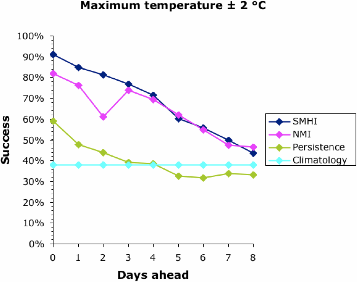
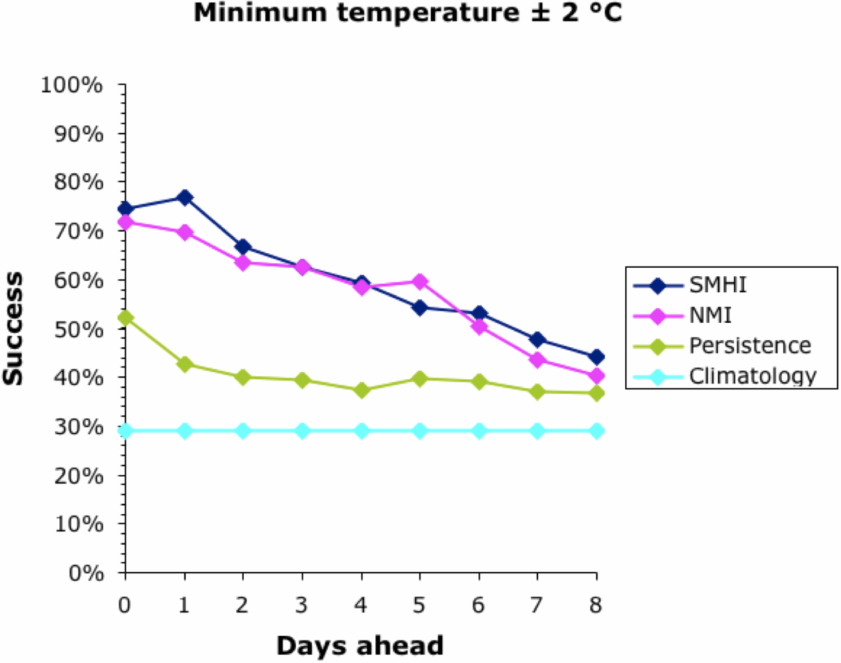
We can start to assess the data by looking at a simple measure of success — the percentage of days on which the actual temperature was within 2°C of that forecast. This is shown for all four forecasts in the next two graphs, for the maximum and minimum temperatures, respectively.


Note that the success of the baseline Climatology forecasts remained constant irrespective of how far ahead the forecast was, because it is based on previous years' patterns not the current weather. The success of the other forecasts decreased into the future, meaning that it is easier to forecast tomorrow than next week. All forecasts converged at 30-40% success at about 9 days ahead. This is why most meteorological bureaus only issue 10-day forecasts (including the current day). This, then, defines the limits of the current climatology models for Uppsala; and it matches those quoted above for the U.K. and U.S.A.

Interestingly, the success of all forecasts was better for the maximum temperature than the minimum, except for the Persistence baseline which was generally the other way around. This remains unexplained. The Persistence baseline was generally a better forecaster than the Climatology one; after all, it is based on current weather not previous years'. However, for the maximum temperature this was only true for a couple of days into the future.

Both of the meteorological bureaus did consistently better than the two baseline forecasts, although this decreased consistently into the future. Sadly, even forecasting the current day's maximum temperature was successful to within 2°C only 90% of the time, and the minimum was successful only 75% of the time. This also matches the data quoted above for the U.K. and U.S.A.

Both bureaus produced better forecasts for the maximum temperature than for the minimum. The SMHI forecast was better than the NMI for the first 2–3 days ahead, but not after that. The dip in the NMI success occurred when changing from the smoothed hourly forecasts to the 6-hour forecasts, which suggests a problem in the algorithm used to produce the web page.

We can now move on to considering the actual temperature forecasts. The next two graphs show the difference between the actual temperature and the forecast one, averaged across the whole year. For a perfect set of forecasts, this difference would be zero.


The Climatology baseline forecasts overestimated both the maximum and minimum temperatures, which suggests that the recording year was generally colder than average. Some replication of years is obviously needed in this assessment. The Persistence baseline increasingly underestimated the future temperature slightly. This implies that the future was generally warmer than the present, which should not be true across a whole year — perhaps it is related to the presence of two unusually warm spells in 2014.

Both bureaus consistently under-estimated the maximum temperature and over-estimated the minimum. NMI consistently produced lower forecasts than did SMHI. Thus, NMI did better at forecasting the minimum temperature but worse at forecasting the maximum. Interestingly, the difference between the forecast and actual temperature did not always get worse with increasing time ahead.

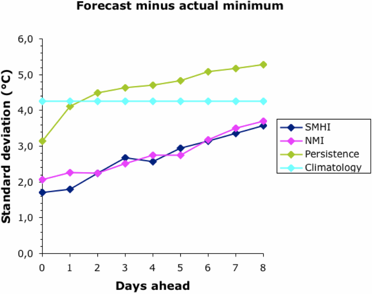
Finally, we should look at the variability of the forecasts. The next two graphs show how variable were the differences between the actual temperature and the forecast one, taken across the whole year.


Other than for Climatology, the forecasts became more variable the further they were into the future. There was no difference between the two bureaus; and, as noted above, their forecasts converged to the Climatology baseline at about 9 days ahead. The Persistence baseline forecasts were usually more variable than this.

Overall, the meteorological bureaus did better than the automated forecasts from the baseline methods. That is, they do better than merely forecasting the weather based on either today or recent years. However, there were consistent differences between the actual and forecast temperatures, and also between the two bureaus. Their models are obviously different; and neither of them achieved better than a 75-90% success rate even for the current day.

Long-term Forecasts

This next graph shows the frequency histogram of the long-range temperature forecasts from the WeatherWIZ site, based on 5-degree intervals (ie. 0 means –2.5 < °C < +2.5).


The forecasts were within 5°C of the actual temperature 68% of the time for the maximum and 62% for the minimum, with a slight bias towards under-estimates. This bias presumably reflects the higher temperatures in recent years, compared to the data from which the forecasts were made. (Has anyone commented on this, that long-range forecasts will be less accurate in the face of Global Warming?)

The WeatherWIZ forecasting result seems to be remarkably good, given that the current weather is not taken into account in the forecast, only long-term patterns. This does imply that two-thirds of our ability to forecast tomorrow's weather has nothing to do with today's weather, only today's date.

However, the forecasts were occasionally more than 15°C wrong (–13.2 to +16.2 for the maximum temperature, and –14.2 to +18.8 for the minimum). This occurred when unseasonable weather happened, such as during the mid-winter warm spell. So, the one-third of forecast unpredictability can be really, really bad — today's weather is not irrelevant!

The rainfall forecasts, on the other hand, were not all that impressive (based on the 300 days rather than the whole year). This is not unexpected, given the locally variable nature of rain.

If we classify the DryDay forecasts as true or false positives, and true or false negatives, then we can calculate a set of standard characteristics to describe the "dry" day forecasting success:
Sensitivity (true positive rate) =
Specificity (true negative rate) =
Precision (positive predictive value) =
Accuracy =
33.8% actual dry days were correctly forecast
81.8% actual non-dry days were correctly forecast
67.1% forecasts were correct
56.7% forecast "dry" days were correct
This shows that the forecasting method actually does better at predicting non-dry days than dry days (61% of the days actually had <0.2 mm of rain).

However, overall, the method does better than random chance, with a Relative Risk of 0.622 (95% CI: 0.443–0.872) — that is, the chance of rain on a forecast "dry" day was 62% of that on the other days. The following ROC curve illustrates the good and the bad, with a rapid rise in sensitivity without loss of specificity (as desired), but the forecasts then become rapidly non-specific.


Conclusion

"But who wants to be foretold the weather? It is bad enough when it comes, without our having the misery of knowing about it beforehand."
― Jerome K. Jerome, Three Men in a Boat