Showing posts with label Fast food. Show all posts

Sunday, December 25, 2016

James Bond, alcoholic


Merry Christmas to everyone. As usual for this blog at this time of year, for your Christmas reading we will take a look at a particular aspect of human consumption, in this case alcohol.

James Bond was created in 1953 by Ian Fleming (who also created Chitty-Chitty-Bang-Bang, The Magical Car), and over a 14-year period there was a series of 12 novels and two short-story collections. The rights to the character were purchased for the film world in the 1960s, so that over the past 50 years we have had a franchise of 24 official films, plus two other licensed ones (Casino Royale in 1967, and Never Say Never Again in 1983).

Actually, the first licensed Bond film was a long-forgotten one made for CBS TV in 1954. This was a 1-hour version of Casino Royale, starring Barry Nelson as Bond, Peter Lorre as Le Chiffre, and Linda Christian as a renamed Vesper Lynd (see Barry Nelson - den bortglömde Bond).

This movie infographic (excluding the 2015 film, and the unofficial films) is from The Economist.


The Bond character

James Bond has been portrayed in films officially by six different actors, but the character remains essentially the same, although somewhat different from the one depicted in the books.

In early 1997, the monthly magazine Men's Health published an article in which doctors and psychologists commented on the life and lifestyle of the Bond character, the world's most un-secret secret agent (see Sprit, kvinnor och cigarretter tog livet av James Bond). The results were not good — Bond was either dead or close to it, as he was a paranoid, impotent alcoholic.

Bond's psychological profile was that of an emotionally stunted psychopath of type A who suffers from post-traumatic stress. According to Fleming's books, Bond was orphaned at age 11 (his parents died in a mountaineering accident), he lost his virginity in a brothel in Paris at 16, and killed his first mistress the following year. An ideal man to be a licensed assassin.

His massive daily alcohol consumption (all carefully documented in both the books and films) makes him a category 3 alcoholic. This means that he couldn't possibly have done his actual job competently; and it should also have led to violent temper outbursts (which may explain the government-sanctioned killing sprees). The liquor should also have led to a shrinking of his genitals, and have damaged his liver to the extent that it could no longer break down estrogen, so that he started to develop breasts and become impotent. His well-documented sexual excesses would also make him a prime candidate for sexually transmitted diseases. On top of this, the books (but not the films) also document a comprehensive smoking habit.

Bond was, of course, a form of wish-fulfillment for his creator, Ian Fleming, who was also a heavy drinker and smoker. He died of a heart attack at age 56, an age that Bond himself could not possibly have out-lived. Bond was more in danger from his own lifestyle than from SMERSH, or anyone else bent on world domination.

Bond is thus more a collection of memes than an actual character. This infographic is from the GBShowPlates website, and summarizes Bond's lifestyle.


The Bond drinks

Just about every aspect of Bond's career has been analyzed, and ranked, from the music to the cars to the watches, and most especially the women (the so-called "Bond girls"). However, much of the interest seems to lie in the booze, which is what we will look at here.

Along with coffee (and, once, tea), Bond has consumed copious amounts of alcohol, which he tends to drink alone, or in private settings. He is also what is known as a "label drinker", in that the brand is at least as important as the bottle's contents. This is a gift for the liquor industry, who, along with the car industry, are perpetually looking for opportunities for "brand placement" in films and sporting events. Fleming was chastised for introducing this into his books, but he simply replied that it was an attempt to round-out the character.

As far as the novels are concerned, they have received special medical attention by Graham Johnson, Indra Neil Guha, Patrick Davies (2013. Were James Bond’s drinks shaken because of alcohol induced tremor? British Medical Journal 347: f7255). They recorded every drink consumed in every book, calculated the number of alcohol units involved, and then converted that to daily intake (since the books are quite clear about their time span).

Their results are summarized in this infographic, from their article.


Basically, the medical results were as before:
Across 12 of the 14 books, 123.5 days were described, though Bond was unable to consume alcohol for 36 days because of external pressures (admission to hospital, incarceration, rehabilitation). During this time he was documented as consuming 1150.15 units of alcohol. Taking into account days when he was unable to drink, his average alcohol consumption was 92 units a week (1150 units over 87.5 days). Inclusion of the days incarcerated brings his consumption down to 65.2 units a week. His maximum daily consumption was 49.8 units (From Russia with Love day 3). He had 12.5 alcohol free days out of the 87.5 days on which he was able to drink.
Furthermore, when we plotted Bond's alcohol consumption over time, his intake dropped in the middle of his career but gradually increased towards the end. This consistent but variable lifetime drinking pattern has been reported in patients with alcoholic liver disease.
UK NHS [National Health Service] recommendations for alcohol consumption state that an adult male should drink no more than 21 units a week, with no more than 4 units on any one day, and at least two alcohol free days a week. James Bond's drinking habits are well in excess of each of these three parameters. This level of consumption makes him a category 3 drinker (>60 g alcohol / day) and therefore in the highest risk group for malignancies, depression, hypertension, and cirrhosis. He is also at high risk of suffering from sexual dysfunction, which would considerably affect his womanising.
Analyzing the films is more difficult. A number of people have tackled this task, including Nerdist, The Grocer, and Atomic Martinis (now defunct, but repeated on the website of the world's only James Bond Museum, in Sweden), and David Leigh. The basic problem seems to be whether the alcohol is "spotted either in hand, glass or in the background". Also, "The major problem is 007’s frequent enjoyment of multiple bottles of champagne, or portions of bottles of liquor ... it is often impossible to determine exactly how many separate drinks came from a given bottle."

The following infographic (not including the 2015 movie or the unofficial films) is derived from one produced at Buddy Loans. However, some of the people at Reddit were not happy with the original, so it was redesigned, as shown here.


The people at Nerdist took the data from this film infographic, converted it from units of alcohol to grams of alcohol, and then used this to estimate Bond’s total alcohol content. This yields a Blood Alcohol Content of 3.7%. "While some humans have survived a BAC of past 1%, it generally holds that anything past 0.5% will either kill you or leave you seriously poisoned. Therefore ... Bond’s tipsy tally is enough to put a man past a safe limit seven times over."

At The Grocer, they have also pointed out the relative booziness of the various Bond incarnations, by calculating the average intake per film by each actor, in units of alcohol:
Sean Connery
George Lazenby
Roger Moore
Timothy Dalton
Pierce Brosnan
Daniel Craig
11
  9
11
  4.5
12
20
Finally, we need a phylogenetic network, of course. I collated the presence/absence of each drink type for each book and movie (excluding the 2015 film) from the book by David Leigh (2012. The Complete Guide to the Drinks of James Bond, 2nd edition. Kindle), and then updated this where it clearly disagrees with other sources. (For example, no mention is made of sherry, and yet it is involved in one of the most popular Bond scenes from the film version of Diamonds are Forever.) I then analyzed the data using a NeighborNet. (James Bond Memes has tried an ordination analysis of the same data source.)


The books are shown in red, and the early films starring Connery and Lazenby are shown in blue (including Connery's later Never Say Never Again). These books and films are almost all at the top and right of the network, indicating that they have a distinct collection of drink types compared to the later films. I suspect that this reflects increasing use of "product placements" in the films. The only book plus movie combination that has similar drinks is You Only Live Twice. Interestingly, the Skyfall movie (from 2012) seems to return to the drinks genre of the earlier works, even though the alcohol consumption is much higher. The most unusual works were the Goldfinger and On Her Majesty's Secret Service books, where a number of drink styles were consumed that appeared nowhere else in the canon.

As noted by Johnson et al. (quoted above):
Despite his alcohol consumption, [Bond] is still described as being able to carry out highly complicated tasks and function at an extraordinarily high level. This is likely to be pure fiction.

Friday, December 25, 2015

Fast food studies


Season's greetings.

For your Christmas reading, this blog usually provides a seasonally appropriate post on fast food, including to date posts about: nutrition (McDonald's fast-food), geography (Fast-food maps) and diet (Fast food and diet). This year, we will update some of the geographical and diet information about the effects of fast food on people worldwide.

First, there seems to be a general perception that access to fast food is continuing to increase in the modern world, even though that increase started more than half a century ago. Such a perception is easy to verify in the USA, as shown in a previous post (Fast-food maps). However, this trend also appears globally.

For example, in 2013 the Guardian newspaper produced a dataset (called the McMap of the World) illustrating the recent growth in the number of McDonald's restaurants worldwide (McDonald's 34,492 restaurants: where are they?). This first graph shows the relative number of restaurants in 2007 and 2012, with each dot representing a single country. Almost all of the 116 countries showed an increase during the five years (ie. their dots are above the pink line). The only country with a major decrease in McDonald's restaurants was Greece (to the right of the pink line), due, no doubt, to its ongoing financial problems. The country with the largest number of restaurants is, of course, the USA, with Japan a clear second.


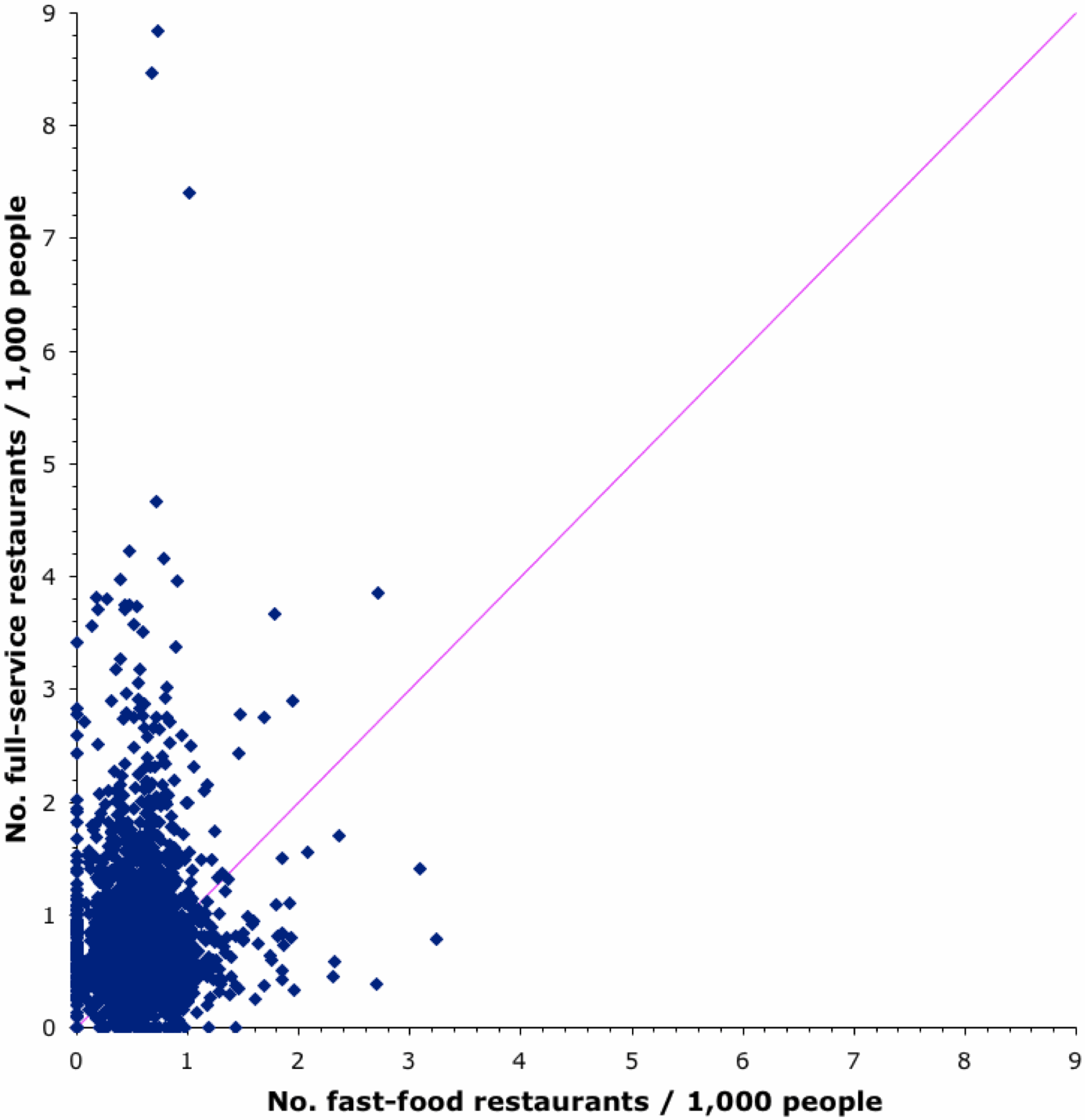
There is also a perception that fast-food restaurants compete for customers against other types of restaurants, so that suburbs can have one or the other but not both. This can be checked using the data in the Food Environment Atlas 2014 (produced by the USDA Economic Research Service), which show the number of both Fast-food and Full-service restaurants / 1,000 popele in 2012 for each of the more than 3,100 counties in the USA. This is illustrated in the next graph, where each dot represents a single county.


For most counties, full-service restaurants actually out-number fast-food restaurants, per capita. There are even a few counties that have no fast-food places at all, but also a few with no full-service restaurants. There are even a few with neither restaurant type, notably in AK (2 counties), KY and ND. Interestingly, 3 out of the 4 counties with the largest density of full-service restaurants are in CO (including one not shown because it is off the top of the graph).

Nevertheless, you can't go far in the USA without encountering a fast-food place. As shown in a previous post (Fast-food maps), Subway has the largest number of establishments, not McDonald's. The Flowing Data blog has recently compiled a couple of maps showing the dominance of Subway in the sandwich business (Where Subway dominates its sandwich place competition, basically everywhere). This map shows the subway dominance — each dot is an area with a 10-mile radius, colored by the brand of the nearest sandwich chain.

Unfortunately, studying the effects of geography on access to fast food is not as simple as it might seem. Large-scale patterns such as those shown above are only part of the picture, because access to fast food is usually assumed to be determined at a very local scale — how far from you is the nearest fast-food place, and how easy is it to get there?

There have been many studies over the years, based on different methods and with different study criteria. These have been summarized (from different perspectives) by SE Fleischhacker, KR Evenson, DA Rodriguez, AS Ammerman (2010. A systematic review of fast food access studies. Obesity Reviews 12: e460) and LK Fraser, KL Edwards, J Cade, GP Clarke (2010. The geography of fast food outlets: a review. International Journal of Environmental Research and Public Health 7: 2290-2308).

Their conclusions from their worldwide literature reviews include:
  • most studies indicated fast-food restaurants were more prevalent in low-income areas compared with middle- to higher-income areas (ie. there is a positive association between availability of fast-food outlets and increasing socio-economic deprivation);
  • most studies found that fast food restaurants were more prevalent in areas with higher concentrations of ethnic minority groups;
  • those studies that included overweight or obesity data (usually measured as the body mass index) showed conflicting results between obesity / overweight and fast-food outlet availability — most studies found that higher body mass index was associated with living in areas with increased exposure to fast food, but the remaining studies did not find any such association;
  • there is some evidence that fast food availability is associated with lower fruit and vegetable intake.
In a previous post (Fast food and diet) I illustrated the association between fast food and obesity in the USA. Here, I use the data from the Guardian article mentioned above (McMap of the World) to do the same thing at a global scale. This next graph shows the relationship between the per capita density of McDonald's restaurants and overweight / obesity for those countries for which there are data available (each dot represents a single country).


These patterns have continued over the five years since the reviews appeared, with published studies both pro (eg. J Currie, S DellaVigna, E Moretti, V Pathania. 2010. The effect of fast food restaurants on obesity and weight gain. American Economic Journal: Economic Policy 2: 32-63) and con (AS Richardson, J Boone-Heinonen, BM Popkin, P Gordon-Larsen. 2011. Neighborhood fast food restaurants and fast food consumption: a national study. BMC Public Health 11: 543) the association between fast food availability and health. To them has been added the issue of Type II diabetes and fast-food consumption (see DH Bodicoat et al. 2014. Is the number of fast-food outlets in the neighbourhood related to screen-detected type 2 diabetes mellitus and associated risk factors? Public Health Nutrition 18 : 1698-1705).

Moving on, people have also considered how the role of restaurants might define the identity of American cities. For example, Zachary Paul Neal has considered whether US cities can be classified on the basis of the local prevalence of specific types of restaurants (2006. Culinary deserts, gastronomic oases: a classification of US cities. Urban Studies 43: 1-21). He counted the numbers of several different types of restaurants in 243 of the most populous cities in the USA, and ended up classifying them into four distinct city types: Urbane oases (where one finds an abundance of restaurants of all sorts), McCulture oases (which have larger than normal concentrations of "highly standardised eating places designed for mass consumption"), Urbane deserts and McCulture deserts (both of which have fewer restaurants than their respective oasis counterpart).

Unfortunately, this sort of classification approach is self-fulfilling, because any mathematical grouping algorithm will form groups, by definition, even if there are no groups in the data. I have shown this a number of times in this blog (eg. Network analysis of scotch whiskies; Single-malt scotch whiskies — a network). These culinary data are thus crying out for a network analysis, and I would normally present one at this point in the blog post. However, I do not have a copy of Neal's dataset.

So, instead, I will finish by analyzing some data on the salt content of fast food (E Dunford et al. 2012. The variability of reported salt levels in fast foods across six countries: opportunities for salt reduction. Canadian Medical Association Journal 184: 1023-1028).

The authors collected data on the salt content of products served by six fast food chains that operate in Australia, Canada, France, New Zealand, the United Kingdom and the United States — Burger King, Domino’s Pizza, Kentucky Fried Chicken, McDonald’s, Pizza Hut and Subway. The product categories included: savoury breakfast items, burgers, chicken products, french fries, pizza, salads, and sandwiches. Data were collated for all of the products provided by all of the companies that fitted into these categories (137-523 products per country). Mean salt contents and their ranges were calculated, and compared within and between countries and companies.

We can use a phylogenetic network to visualize these data. As usual, I have used the manhattan distance and a neighbor-net network. The result is shown in the next figure. Countries that are closely connected in the network are similar to each other based on their fast-food salt content, and those that are further apart are progressively more different from each other.


You will note that the North American countries are on one side of the network, with the highest salt content, while the European countries are on the other, with the lowest salt content (on average 85% of the American salt content). This difference was reflected even between the same products in different countries — for example, McDonald's Chicken McNuggets contained 0.6 g of salt per 100 g in the UK but 1.6 g of salt per 100 g in the USA). As the authors note: "the marked differences in salt content of very similar products suggest that technical reasons are not a primary explanation."

Monday, August 31, 2015

The solution to the spinach fallacy?


Last week I blogged about Spinach and the iron fallacy. I analysed an early set of data by Thomas Richardson (1848), who calculated the amount of iron in combusted ash for various vegetables and fruits, and showed that spinach is not at all unusual in its constituents. The idea that spinach is rich in iron is untrue, and the story about a mis-placed decimal point seems to be nothing more than an urban myth.

In the meantime, Joachim Dagg, at the Natural History Apostilles blog, has reanalysed Richardson's data and revealed that The first source for the spinach-iron myth is likely to have been a somewhat inappropriate attempt to combine his data for the percent iron values in relation to the ash with the percent values of the ashes in relation to the fresh matter.

So, I have recalculated the phylogenetic network using these "adjusted" values. I used the percent values of the chemical constituents in relation to the pure ash (raw ash minus carbonic acid, charcoal and sand), and combined them with the percent values of the ashes. The issue here is that radish roots and leaves have the largest ash values, followed by cherry stems and spinach. This leads to an over-statement of the chemical contents. In particular, the iron content moves spinach from being ranked sixth to second (behind radish foliage, which is not usually eaten).


Monday, August 24, 2015

Spinach and the iron fallacy


A few weeks ago, the Natural History Apostilles blog ran a series of posts on the origins of the well-known spinach-is-rich-in-iron fallacy. This is more complex than expected. Spinach was originally alleged to have been incorrectly claimed to be rich in iron due to a mis-placed decimal point in a set of comparative data. In fact, this explanation itself seems to be untrue (read the posts).

In the blog posts, Joachim Dagg traced the origins of the alleged explanation, in detail, looking at (almost) all of the relevant historical data. One of the earliest sources of data on spinach turns out to be itself something of a mystery:
Thomas Richardson (1848) Beiträge zur chemischen Kenntnis der Vegetabilien. Annalen der Chemie und Pharmacie LXVII Bd. 3.
This was a single-page fold-out table (without page number) included at the end of volume 67 of the journal. In modern electronic copies, it has been erroneously attached to the last article in that issue.

The table contains values for a range of compounds in the ash produced from a variety of plants and their parts. These data are ripe for a visualization.

As usual, we can use a phylogenetic network as a form of exploratory data analysis, to compare all of the plants in a single diagram. I first normalized the data (since the compounds have very different ranges), and then used the manhattan distance to calculate the similarity of the plants based on their constituents. This was followed by a Neighbor-net analysis to display the between-plant similarities as a phylogenetic network. So, plants (or their parts) that are closely connected in the network are similar to each other based on their chemistry, and those that are further apart are progressively more different from each other.


As you can see, spinach is not particularly unusual in its chemical constituents. Indeed, it is radish, leek and asparagus that are the most unusual.

Note: there is a follow-up post indicating why spinach might have been singled out as having a high iron content: The solution to the spinach fallacy?

Monday, February 9, 2015

A network analysis of pizza styles


Over the past century a number of food styles have become internationalized, including hamburgers and fried chicken. Not all of these foodstuffs are nutritious, and some people have noted that not all of them are even particularly edible. However, perhaps the most interesting of these foods is the venerable pizza, not least because the customer has considerable say in what it looks and tastes like, but also because it is made and cooked fresh, right in front of us.


Pizza originated in Italy, Greece, or Persia, depending on how we define pizza. After all, covering flat bread with a topping is an idea that goes back a very long way. In the ancient world, the Egyptians made flat bread; the Indians baked bread in an oven, but without a topping; and the Persians cooked their bread without an oven, but they did put melted cheese on it. The Passion 4 Pizza site notes this more recent history: "The ancient Greeks had a flat bread called plakountos, on which they placed various toppings [eg. herbs, onion and garlic], and we know also that Naples was founded (as Neopolis) by the Greeks; and Naples is the home of the modern pizza."

In 16th century Naples, a yeast-based flat bread was referred to as a pizza, eaten by poor people as a street food; but the idea that led to modern pizza was the use of tomato as a topping. Tomatoes were introduced to Europe from South America in the 16th century, and by the 18th century it was common for the poor of the area around Naples to add tomato to their bread. Pizza was brought to the United States by the Italian immigrants in the late 19th century, and became popular in places like New York and Chicago.

Kenji López-Alt publishes The Pizza Lab, which is part of the Serious Eats blog, and he has taken a serious interest in pizza styles, at least in New York. He recognizes three main styles of pizza, based on their dough, the way it is treated, and the temperature at which it is cooked (see the picture above, left to right):
  • New York
  • Sicilian
  • Neapolitan
He also has several variants on these styles.

As a basis for discussion, I have analyzed the dough ingredients of these three styles, using a phylogenetic network as a tool for exploratory data analysis. To create the network, I first calculated the similarity of the pizzas using the Manhattan distance, and a Neighbor-net analysis was then used to display the between-dough similarities as a phylogenetic network. So, pizza-dough styles that are closely connected in the network are similar to each other based on their ingredients, and those that are further apart are progressively more different from each other.


The Neapolitan-style dough is the simplest in terms of ingredients. The dough is not kneaded, but instead is allowed to rise for 3-5 days in the refrigerator, although it remains a thin-crust pizza. It is cooked quickly at a high temperature. The New York-style dough is an offshoot of this that is slightly thicker, and is cooked cooler and slower. The unkneaded dough stands in the fridge for only 1 day. Like all of the styles except the Neapolitan, olive oil is used in the dough, but unlike any of the others it also contains sugar (to help the crust brown more evenly). The Sicilian-style dough is intended for a thick-crust pizza. It requires only a little kneading, after which it is allowed to rise for 2 hours at room temperature. It is essentially fried in olive oil while baking.

The Sfincione is the original Sicilian pizza style, thinner and chewier than the New York Sicilian. It is also cooked at a lower temperature. The Deep Pan pizza is, of course, another thick-crust style. It is allowed to rise for longer than the Sicilian, and is cooked at a higher temperature. The network shows that these all have closely related doughs.

The Greek-style pizza is allegedly a style "found mostly in the 'Pizza Houses' and 'Houses of Pizza' in New England". As shown by the reticulation in the network, it has characteristics of the Neapolitan pizza dough (relatively low water content) and the Sicilian (relatively high oil content). It is left to rise at room temperature overnight, and is cooked like the New York and Deep Pan pizzas.

There are many other pizza styles, of course, but I do not have recipes for them. For example, there is another Deep Dish style found in Chicago.

Thursday, December 25, 2014

Fast food and diet


Season's greetings.

For your Christmas reading, this blog usually provides a seasonally appropriate post on fast food, including to date: nutrition (McDonald's fast-food) and geography (Fast-food maps). This year, we will focus on the effects of fast food on people.

Defining fast-food is a bit of a trick. The U.S. Census of Retail Trade defines a fast-food establishment merely as one that does not offer table service. However, legislation recently passed in Los Angeles defines fast-food establishments as those that have a limited menu, items prepared in advance or heated quickly, no table service, and disposable wrappings or containers. Some people feel that these definitions should include all pizza restaurants, even those that do offer table service in addition to take-away (or take-out). The latter are sometimes distinguished as fast-casual restaurants rather than fast-food restaurants.

About 90% of Americans say they eat fast-food, including those who visit an establishment on average once per day. The main concern about the effect of fast-food, then, is on people's diet. By "diet" I mean the combination of foodstuffs consumed each day, which may or may not match what is known to be required for a healthy human. Fast-food rarely matches this diet, and so there must be some effect of eating the stuff.

In particular, fast-food has been implicated in what is now known within medicine as the "obesity epidemic" — the observation that an increasing proportion of the people in the developed world are formally classified as obese. The usual symptom of obesity is a body mass index (BMI) > 30 (overweight is 25-30, normal is 18.5-25). BMI is an approximate measure of body fat.

Obesity has risen rapidly in recent decades, but there is some evidence that the levels are now beginning to stabilize (Obesity Rates & Trends Overview). The main risk with obesity is its strong association with potentially fatal health problems, notably heart disease, stroke, high blood pressure, and diabetes. Indeed, it has been suggested that obesity may be the greatest cause of preventable death in the United States.


Demonstrating a relationship between fast-food and obesity is not hard, given the high sugar, carbohydrate, fat, and salt content of most of the food items. This results in the intake of more energy than the body uses, and this excess is stored as fat. This pattern shows up clearly in large-scale samples of prevalence, such as this one collated on the DataMasher site, where each point represents a state of the USA.


An obvious issue concerning fast-food is our ability, or lack of it, to understand just how many calories (or joules) there are in fast-food meals. The marketing people seem to have a clear idea about how different fast-food chains are presented in terms of their food quality, as shown in this Perceptual Map.


However, this perception is clearly not accurate in terms of calories, especially for Subway. An article in the British Medical Journal evaluated the ability of people to estimate the calorie content of the fast-food meal they had just purchased. As shown in the next graph, clearly in most cases there was a major under-estimate, and this was worst for the highest-calorie meals. The under-estimation of calorie content was largest among Subway diners. Diners at both Subway and Burger King showed greater under-estimation of meal calorie content than those at McDonald's, whereas diners at Dunkin' Donuts had less under-estimation. In other words, Subway is not as healthy for you as you think it is, but you already know how bad those Donuts are.


One response to this situation has been to insist that fast-food places advertise the calorie content of their food on the menu board itself. For example, it has been suggested that nutrition experts can compose apparently healthy meals based on the nutritional information provided in the menus of fast-food restaurant chains.

This will only have an effect, however, if people actually use this information when choosing their meal. An article in the Journal of Public Health suggested that most young people don't actually do so, and that people who eat fast-food most often are least likely to do so. Indeed, a report from Sandelman Associates showed that the only people who are likely to use calorie information regularly are those with a specific "calorie target" for their personal diet, as shown in this next chart.


Nevertheless, an article published in the British Medical Journal has reported a decrease in the energy content of fast-food purchases after the introduction of calorie information on the menu boards, except at Subway, where there was an increase. (Before the labeling the Subway meals chosen had fewer calories than for the other chains but afterwards they had more!)

Another important feature of fast-food is the usually large portion sizes, which exacerbates the energy imbalance. An article in the Journal of the American Dietetic Association has shown that not only does modern fast-food exceed dietary standard serving sizes by at least a factor of 2, and sometimes by as much as 8, these serving sizes have increased dramatically over the past 50 years.

What is perhaps most surprising is the truly vast difference that can occur between servings of what is allegedly the same fast-food product, not only between countries but within a single country. The following graph is from an article in the International Journal of Obesity. It shows, for the named locations, the amounts of total fat in a meal consisting of 171 g McDonald's french fries and 160 g KFC chicken nuggets. The darker colour indicates the added amounts of industrially produced trans fat. The values in parenthesis are the amount of trans fat as a percentage of total fat.


On a somewhat different note, one of the main characteristics of fast-food is the focus on a sweet taste, rather than on a diversity of tastes. In contrast, traditional cooking in many cultures has focussed on mixing together a diversity of complementary ingredients. Indeed, this was the impetus for the formation of the Slow Food movement, founded "to prevent the disappearance of local food cultures and traditions ... and combat people's dwindling interest in the food they eat, where it comes from and how our food choices affect the world around us." (It was organized after a public demonstration at the intended site of a McDonald's franchise at the historic Spanish Steps, in Rome.)

This topic was investigated in detail in an article published in Nature Scientific Reports. The authors produced the following network of food flavours.


Interestingly, they conclude that:
We introduce a flavor network that captures the flavor compounds shared by culinary ingredients. Western cuisines show a tendency to use ingredient pairs that share many flavor compounds, supporting the so-called food-pairing hypothesis. By contrast, East Asian cuisines tend to avoid compound-sharing ingredients.
There is diversity even in the amount of diversity.

Wednesday, June 11, 2014

Evolution and timelines


Any history can be represented as a timeline, but a timeline diagram does not necessarily show an evolutionary history. Unfortunately, this does not stop people from putting the word "evolution" on their timeline diagrams.

A timeline simply represents the timing of certain events. These events are presumably related in some way, but they do not necessarily refer to the history of a set of objects, or even concepts, as we might expect for an evolutionary history. Here is classic example of a perfectly valid timeline that refers to a disparate set of objects / concepts.


Apparently we are expected to infer from this timeline that McDonald's attitude to providing the public with information about the nutritional value of their fast-food products has changed over the decades. But the idea that this changed attitude might involve some sort of evolutionary process is stretching an analogy a bit too far. The timeline certainly represents a journey, as claimed, but not an evolutionary one.

For most members of the general public, "evolution" is a story of the transformation of some object or idea through time, with each stage replacing the previous one. This is a simple story with a beginning, a middle and (possibly) an end. The story can usually be presented as a timeline, of course, with each stage of the transformation arranged in the correct time order. For a biologist, this is a transformation series, representing "transformational evolution", which follows the history of a single lineage through time (ie. a history chain).

There are plenty of examples of this use of a timeline to represent transformational evolution. For instance, consider corporate logos, such as those of these two well-known beverage manufacturers. Each new logo replaced the previous one, thus providing an analogy to evolution of a single object.


The word "evolution" as used here is not one that a biologist would use, but many other people would do so. Bank notes in the USA show a similar phenomenon — in this case, the people involved appear to get younger through time! [The same thing happens on the $100 bill, as well.]


We can even take the idea of transformational evolution and use it for prediction, as was done by Takeshi Fukuda in 2002:


However, biologists do not see the evolution of organisms in this way, at all. For them, evolution is a process of variation, with lots of new forms appearing and some old ones disappearing. So, rather than an ordered series of forms, each one replacing the previous one through time, biologists see an increasing diversity of forms that is counter-acted by loss of forms (ie. extinction). This is "variational evolution" rather than transformational evolution.

Variational evolution is usually represented using a phylogeny, which will be a network or a tree, depending on the particular history, rather than a timeline chain. A phylogeny shows the relationships among a wide variety of objects, many of which will exist (or have existed) at the same time. There may have been replacement of some objects by others, but in general it is the diversity of objects existing at the same time that is of principal interest.

The issue here is that a timeline is a poor way of representing variational evolution. A timeline enforces a linear ordering of relationships, solely because "time's arrow" has one direction only. But a linear temporal order cannot reflect the complex evolutionary relationships among the objects.

Consider this example from McDonald's in Canada. There is a clear timeline here but it does not refer to transformational evolution — instead, it refers to variational evolution. These breakfast items have not necessarily replaced each other, and thus their evolutionary relationships are more complex than can be represented by a timeline.


Indeed, many of these breakfast items are still on the menu today, including: Egg McMuffin, Scrambled Eggs, Hash Browns, Hot Cakes and Sausage, Sausage McMuffin, Sausage McMuffin with Egg, Breakfast Burritos (Sausage), Bagel (Bacon, Egg Cheese, Steak, Egg Cheese), and the Fruit 'N Yoghurt Parfait.

Here is another seemingly simple image from McDonald's but with the same complexity problem — it is variational not transformational.


And finally, here is a much more complex history from Apple computers:


A timeline shows the timing of certain events, which do not necessarily involve replacement. It might be a useful way to represent transformational evolution, but it is a poor way to represent variational evolution. A phylogeny is much more appropriate.

Wednesday, December 25, 2013

Fast-food maps — a network analysis


Season's greetings!

For Christmas last year in this blog we had a Network analysis of McDonald's fast-food, in which I examined the food nutrient content of a well-known fast-food vendor. This year I continue the same theme, but expand it to cover an analysis of the geographical locations of various fast-food chains within the USA.

The US restaurant industry included about 550,000 restaurants in 2012 (SDBCNet). Technically, this food industry distinguishes different types of restaurant. The ones we are interested in here are called "quick service restaurants" (QSR), which includes what are known as fast-food and fast-casual restaurants. These are sometimes also called "limited service restaurants".

There are quite a few QSR companies in the USA, and each of them has quite a few locations. In 2012, there were apparently 313,000 fast-food and fast-casual restaurants (Yahoo Finance blog The Exchange), which is more than 50% of the total restaurants. In 2005, more than two-thirds of the largest 243 cities in the US had more fast-food chains than all other restaurant types combined (Zachary Neal).

The QSRs serve an estimated 50 million Americans daily (The Statistic Brain). Indeed, in a 2011 poll of people in 87 U.S. cities, there were several places where >30% of the people had visited QSRs 20+ times in the previous month (nearly once per day), while in all cities >80% of the people had visited at least once (Sandelman & Associates).


The QSR group reports that the national top 20 fast-food chains for 2012 were as shown in the first graph. This includes both company-owned units as well as franchised locations. Note that McDonald's had 34,480 restaurants in its worldwide system, with 14,157 of those being in the USA (The Exchange).

It is of interest to look at how this pattern has changed through time, and so I have taken the data from the QSR group's reports for 2003 to 2012, inclusive (these are the only ones available online). These data are for the number of locations of each of the top 50 chains each year in terms of dollar income. There are 61 chains that appear in the list for at least one of the years, but only 46 of these appeared often enough in the top 50 to be worth including in the analysis.

For this analysis, we can use a phylogenetic network. As usual, I have used the manhattan distance (on range-standardized data) and a neighbor-net network. The result is shown in the next figure. Fast-food chains that are closely connected in the network are similar to each other based on their restaurant numbers over the past decade, and those that are further apart are progressively more different from each other.


The network forms a simple chain from Subway (the biggest) through to the group of very similar-sized chains at the bottom-left. This indicates that most of the restaurant chains have been fairly consistent in their relative sizes throughout the past decade (ie. the big stayed big and the small stayed small), although some chains have changed size. For example, KFC and Taco Bell have each shrunk by 15% since 2007, while Jack in the Box has expanded by 10%.

However, there is a large reticulation in the network involving Starbucks. This is caused by the fact that Starbucks started the decade as a much smaller chain than both Burger King and Pizza Hut, but it is now much larger than either of them. Similarly, there is another reticulation involving Cold Stone Creamery, which expanded rapidly in 2005 (increasing their number of locations by 50%).

The number of locations does not relate directly to dollar turnover, of course, as Subway has much smaller restaurants than do most of the other chains. In this respect, McDonald's leads the way by a considerable margin, with $35,600,000,000 in system-wide sales in the USA during 2012, versus $12,100,000,000 for Subway. This works out at $2,600,000 and $481,000 per restaurant per year, respectively. Starbucks comes in third, with $10,600,000,000 in 2012 ($1,223,000 per unit).

However, let's stick to the number of units, rather than the dollars, and consider their geographical locations. There are several datasets available on the internet that provide this information for different chains (which you actually could get yourself by visiting the homepage of each chain and asking for the location of each restaurant, one at a time!). If you are prepared to pay some money, then you can have the latest list from AggData; but I am not in that league.

However, apparently the man at the Data Pointed blog is in that league, or was in 2010. His mapped version of the data for McDonald's (only) looks like this next figure (each dot represents one restaurant).


This has led him to contemplate the McFarthest Point, which is the point in the contiguous US states that is furthest from a McDonald's restaurant. He reckons that its map co-ordinates are: +41.94389, –119.54010. He has made an excursion to this spot (along with some fast-food), which you can read about in A Visit To The McFarthest Spot.

In turn, this caused the man at the Consumerist blog to contemplate the equivalent spot for Subway. This is currently estimated to be +42.397327, –117.956840 (Is This the Farthest Away You Can Get From a Subway in the Continental U.S.?).

Returning now to the data sources, you could also look at the data from the Food Environment Atlas (by Vince Breneman and Jessica Todd, of the USDA Economic Research Service). At the time of writing, this contains a Map with Fast-food restaurants / 1000 population for 2009, showing each individual county. This refers to the total number of units, summed across all fast food chains. A similar map is available at Business Insider, aggregated by state (but based on the 2008 data).

However, I cannot pay for the data, and I want the data separately for the different fast-food chains. That leads me to the Fast Food Maps by Ian Spiro. In 2007, he scraped the data from the web pages of various chains (as I noted above), and has made it available as a web page and an associated datafile.

He has included data for 10 of the fast-food chains, based on those present in the state of California. So, he covers only 8 out of the top 20 national chains: McDonald's, Burger King, Pizza Hut, Wendy's, Taco Bell, KFC, Jack in the Box, and Hardee's. To these, he adds Carl's Jr (mainly on the West Coast of the USA) and In-N-Out Burger (mainly in the South-West), which I did not include in my analysis.

To analyze these data, I took the information for each chain in each state and divided this by the number of people in that state (to yield the number of restaurants per 100,000 people per chain per state). I then produced a phylogenetic network, as described above, and as shown in the next graph. States that are closely connected in the network are similar to each other based on the density of restaurants of each chain, and those that are further apart are progressively more different from each other. I have color-coded the states to highlight the similarities.


In the network, the states turn out to be arranged roughly geographically, with a few exceptions. In other words, neighboring states have similar densities of restaurants from certain fast-food chains.

For example, the red-colored states are from the West (including in the Pacific!), and they don't have Hardee's, but do have most of the Jack in the Box restaurants. The brown-colored states are from the North Centre, and these have the highest density of Burger King and Pizza Hut. Montana is separate from this grouping because it has a lower density of both Burger King and KFC.

The orange-colored states are from the Mid West and the South, and these have the highest density of Hardee's. Georgia is separate from this grouping because it has a lower density of Hardee's; and Florida is separate because it has a lower density of most chains. The blue-colored states are also from the Mid West, and these have the highest density of McDonald's and Wendy's. Illinois is separate because of a lower density of most chains (particularly KFC) except for McDonald's.

The dark-green-colored states are from the North East, and these don't have Hardee's, and they have the lowest density of Pizza Hut. The light-green-colored states are also from the North East, and these form a separate grouping because they have a higher density of most chains except McDonald's. Maryland is separate because it has an even higher density of most chains (particularly Hardee's); and Delaware has a higher density of Hardee's and Taco Bell.

Finally, Oklahoma and New Mexico have the highest density of KFC.

NB. For an interactive map showing the locations of the 507 Dunkin' Donuts, 269 Starbucks and 235 McDonald's in New York City (in October 2013), check out Mapping the Big Apple's Big Macs, Coffee, and Donuts. The concentration of Starbucks in downtown and midtown Manhattan is truly impressive. Indeed, 43% of the city's cafés are either Dunkin' Donuts or Starbucks (Coffee and Tea in New York City).

Conclusion

So, there you have it — fast-food is not randomly distributed in the USA. Where you live determines how much you have available of the different types. Indeed, as Pam Allison's Blog notes: "Although restaurants like McDonalds are very popular nationwide, they aren’t necessarily the most popular on a local level. In fact, there are only a handful of zip codes in the United States where McDonald's is the most popular. Rather, many local or regional chains are the more likely choice with consumers."

There are many other aspects to the geography of food, especially fast-food; but these can wait until a later blog post.

Monday, January 7, 2013

Is there good and bad fast-food?


Since the Christmas feast days are now over, this blog post continues the series on the nutritional characteristics of modern fast-food, which started with the Network analysis of McDonald's fast-food.

Men's Health magazine has produced a list of what it considers to be The 10 Worst Fast Food Meals in the USA. They chose one meal (usually a combination of several menu items) from each of ten different fast-food chains, which they considered to be extreme meals based on their nutritional characteristics. To counter-balance this list, they also chose another meal combination from each chain that they considered to be much "better for you".

For each of these 20 meals the magazine provided data on four of the nutritional characteristics: Calories, Fat, Saturated fat, and Sodium (salt). I have analyzed these data in the same manner as before: I standardized the data by expressing them as a percent of the officially recommended daily value based on a 2,000 calorie diet, then calculated a NeighborNet network based on manhattan distances.

The resulting network is shown in the figure. I have coloured the ten allegedly "better for you" meals alternately in green or blue, with all of the "worse for you" meals in black. Meals that are closely connected in the network are similar to each other based on their nutritional characteristics, and those that are further apart are progressively more different from each other.


Clearly, the "worst food" meals differ greatly from each others in their nutritional characteristics, while the other ten meals do not. In other words, there is a single clear concept of what is "good for you" but many different ideas about what is "bad for you" (or many ways in which the food can be unhealthy).

Furthermore, the "worst food" meals vary in their relationship to the better meals, with Long John Silver's Fish Combo Basket being rather similar to the better items, and both KFC's Half Spicy Crispy Chicken Meal and Burger King's Large Triple Whopper being at the extreme far end of the graph. Indeed, the "worst food" meals form a gradient of increasingly extreme nutritional characteristics: the calories, fat and saturated fat all increase from bottom to top in the network, and sodium increases from left to right.

The sodium change applies in the better meals, as well, with Quizno's Roadhouse Steak Sammies having more salt than the other nine meals in that group.

So, it seems to me that the fast-food chains are having a harder time creating unhealthy fish meals than they are creating unhealthy chicken and beef meals. However, this may just be lack of effort on their part, because the Tuna Melts with Cheetos meal is certainly pretty extreme.

Anyway, you now know which meals to target should you wish to send yourself into an early grave.

Wednesday, December 26, 2012

Network analysis of McDonald's fast-food


Season's greetings: or as we say here in Sweden: God jul och gott nytt år! In many cultures, over-dosing on food is traditional at this time of year, so it is appropriate to have a food-related blog post this week. [Note there is a follow-up blog post called: Is there good and bad fast-food?]

In 1954 a multi-mixer salesman decided to check out the fast-food operation of a couple of brothers in California, named McDonald, and then offered to form a partnership with them. Nearly 60 years later, there are approximately 34,000 fast-food stores with this name worldwide, although there are very few in Africa, and I don't think they have any in Antarctica. This virus-like growth has been accompanied by negative comments on the nutritional quality of the food. Indeed, the international Slow Food organization, which cares very much about the traditional quality of food, was first formed to contest the opening of a McDonald's store near the historic Spanish Steps in Rome.

In a blog post amusingly entitled Infinite Mixture Models with Nonparametric Bayes and the Dirichlet Process, Edwin Chen looked at the nutritional content of the food provided by this culinary mega-chain. Another way to look these data is to use a phylogenetic network as a means of exploratory data analysis, which is what I provide here.

The data

The data are taken from the official document McDonald's USA Nutrition Facts for Popular Menu Items, dated 7 August 2012. The stated purpose of the document is this: "We provide a nutrition analysis of our menu items to help you balance your McDonald's meal with other foods you eat. Our goal is to provide you with the information you need to make sensible decisions about balance, variety and moderation in your diet." I presume that the data are accurate, at least on average for each menu item.

The data consist of measurements of 12 dietary characteristics for 82 of the menu food items available in the USA (excluding the drinks), not all of which are necessarily available in other countries. The data for each characteristic are listed as "% Daily Value" based on a 2,000 calorie diet, which thus standardizes the data to the same scale across all of the variables, thereby making them directly comparable. The characteristics are:
  • Calories
  • Total Fat
  • Saturated Fat
  • Carbohydrates
  • Cholesterol
  • Dietary Fiber
  • Protein
  • Sodium
  • Vitamin A
  • Vitamin C
  • Calcium
  • Iron
Sugar values are also listed in the original document, but there is no FDA recommended daily allowance available for sugar, and so these cannot be included in my analysis. The FDA argument is that we get enough calories out of the fat and protein that we eat, and so we don't actually need any extra sugar in our diet.

The analysis

I have analyzed these data using the manhattan distance and a neighbor-net network. The result is shown in the figure. Menu items that are closely connected in the network are similar to each other based on their dietary characteristics, and those that are further apart are progressively more different from each other.

Click to enlarge.

The network is basically a blob, with three side branches. The blob (with menu items labelled in black) represents what we could call "typical" McDonald's products, while the side-branches (with the labels in various colours) represent more extreme products, with either more or less of some of the measured characteristics. Basically, the menu items are increasingly "bad for you" at right and better for you at the very bottom.

I have numbered parts of the side-branches as 1–7 in the figure, and coloured the food names, to indicate various groups that are worth discussing. These groups can be described as follows:
  1. The dark red menu items to the right of (1) include the two Big Breakfast with Hotcakes, each of which provides 55% of your daily calorie needs (while most of the menu items to the left provide <40% each), and 40% of your iron requirements.
  2. The menu items to the right of (2) (in red or dark red) include all four of the Big Breakfasts, which each provide nearly 200% of the recommended daily intake of cholesterol (most of the other items provide < 90%), >60% of the total fat requirement, and >65% of your sodium needs (ie. salt).
  3. The items to the right of (3) (in orange, red or dark red) each provide >35% of your calorie needs and >60% of the total fat requirement, while those to the left provide less.
  4. The purple items below (4) include all of the menu items with added egg, and so these have the next highest cholesterol levels after the four Big Breakfasts, at 80-95% of your daily requirements (the other menu items have <50%).
  5. The four menu items to the left of (5) (in light green) are unique in containing >130% of your vitamin C needs, while the other items each provide <35%.
  6. The items to the left of (6) (in blue or light green) include all of the fruit-based items and potato-based items (fries, hash browns) plus the chicken nuggets and bites. These are distinguished by having relatively low values of several characteristics, including those that are bad for you (total fat, saturated fat, cholesterol, and sodium) and those that are good for you (protein and calcium).
  7. The green items below (7) include all nine of the Premium Salads (but not the Side Salad!). They each provide 160% of your vitamin A requirements (the other items each contain <20%), 25-35% of the vitamin C (most of the others contain <15%), and >15% of your dietary fiber.
The conclusions

This means that, for a healthy diet, you should steer well clear of the four "Big Breakfast" menu items, as they are very extreme even by McDonald's standards — you will need to take part in a great deal of strenuous exercise, to burn off their calories, cholesterol, fat and salt. The "Premium Salads", on the other hand, are extreme by having much less of these "bad for you" characteristics than is usual for McDonald's.

Unfortunately, while the the fruit concoctions (in light green and light blue) look good in the network, they also have more sugar (20-30 g each) than any of the other menu items (except the Cinnamon Melts), and therefore not everyone is a fan of them (eg. Mark Bittman; see also the MNN blog). Incidentally, it is also worth pointing out that fast-food in the USA is often much saltier than it is elsewhere in the world (see the article in Health magazine).

Finally, you might also like to compare the network locations of the menu items to William Harris' 10 Most Popular McDonald's Menu Items of All Time (not all of which have been included in my analysis):
  1. French Fries
  2. Big Mac
  3. Snack Wrap
  4. Happy Meal
  5. Egg McMuffin
  6. Apple Dippers and Baked Apple Pie
  7. Chicken McNuggets and Chicken Select Strips
  8. Premium Salads
  9. Double Cheeseburger
  10. McGriddles Breakfast Sandwich