Monday, August 31, 2020

Coronavirus patterns of spread


Following on from my previous posts about the SARS-CoV-2 virus, and Covid-19, the human disease that it causes, there are a number of miscellaneous topics that could also be discussed. So, here are a few topics about the spread of the pandemic, which may be of interest.

Networks of cases

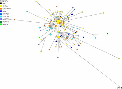
I have so far not presented a phylogenetic network related to the current pandemic. I may one day do so, although collating the data I would like to use will not be easy. In the meantime, the folks over at Fluxus Engineering did publish a network of genomes back in April: Phylogenetic network analysis of SARS-CoV-2 genomes.

Network of SARS-COV-2 genomes

The authors identified:
... three central variants distinguished by amino acid changes, which we have named A, B, and C, with A being the ancestral type according to the bat outgroup coronavirus. The A and C types are found in significant proportions outside East Asia, that is, in Europeans and Americans. In contrast, the B type is the most common type in East Asia, and its ancestral genome appears not to have spread outside East Asia without first mutating into derived B types, pointing to founder effects or immunological or environmental resistance against this type outside Asia.
Needless to say, their paper generated some controversy, with three published responses criticizing the methodology (these are shown at the link above). However, the Global Initiative on Sharing All Influenza Data (GISAID) uses an expanded version of their cladistic classification.

Networks can also be used much more locally, to illustrate spread, although in an epidemic this will almost always be tree-like rather than reticulating. Here is a recent example from China: Large SARS-CoV-2 outbreak caused by asymptomatic traveler. The authors comment about the wide spread from a one individual:
An asymptomatic person infected with severe acute respiratory syndrome coronavirus 2 returned to Heilongjiang Province, China, after international travel. The traveler’s neighbor became infected and generated a cluster of >71 cases, including cases in 2 hospitals. Genome sequences of the virus were distinct from viral genomes previously circulating in China.


Different patterns of infection among communities

Pandemics are actually a series of local epidemics, and are therefore rarely simple things, in terms of when people become infected. For example, there are often a series of alternating "waves" of new cases, in response to the behavior of either the pathogen or the people themselves.

In the case of the Covid-19 disease, the virus has so far apparently produced a series of at least seven variant strains (Geographic and genomic distribution of SARS-CoV-2 mutations), but the waves are mainly the result of people's implementation of infection control measures. Depending on the pathogen, these measures can include: social distancing, fewer / smaller crowds (especially indoors), working from home, closing social venues such as restaurants and bars, as well as mass testing and infection tracking. Reducing the spread of breath aerosols also works well for SARS-CoV-2, including careful cleaning of surfaces, and wearing gloves and masks or visors.


So, early on in most epidemics, people get infected because they are not ready to deal with things; and the number of cases increases, as shown in the above graph of Covid-19 cases in the USA this year — this is the First Wave. The number of cases then usually decreases for a while, in response to the effectiveness of the control measures. However, if the measures do not remain effective, or the people get sick of implementing them, then the number of cases increases again, creating the Second Wave. The graph above makes it clear that for the USA the Second Wave has been much more serious than the First, in terms of the number of cases.

However, this picture is often much too simple, because the USA is a pretty big place. In this example, there are 50 main jurisdictions in the country, and there is no reason to expect any epidemic to proceed in the same way in every state and territory. Here are equivalent graphs for four different US states, each showing a different pattern of waves.


So, New York (and several other north-eastern states) got the SARS-CoV-2 virus early on, and most of the at-risk people got infected at that time, so that there has not yet been a Second Wave. Rhode Island, on the other hand, has actually had a small Second Wave. From here on in the north-east, infections are likely to be mostly local outbreaks (eg. New York city mayor says rise in Covid-19 cases in Brooklyn not a cluster), such as is now also being observed in Europe.

By contrast, Louisiana, the state with the highest percent of cases (per population) so far, had a relatively small First Wave, and it is the Second Wave that has been much more problematic for epidemic control. Even more extreme, Florida (and other states like California) had the virus spread much later, so that there was not really a First Wave at the same time as the other states, and it is the Second Wave that is producing the high percentage of infected people.

So, the country's pattern of pandemic spread is made up of a series of different sub-patterns of epidemics, with different jurisdictions having very different degrees of success in controlling virus spread. This matters very much for any national response to the pandemic, because it is not the same epidemic everywhere.

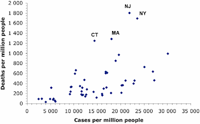
In a similar manner, deaths have been concentrated in those places that got the SARS-CoV-2 virus early on. We expect for most pandemics that the number of deaths will rise as the number of infection cases rises. This next graph shows the case rates (proportion of people infected) and death rates (proportion of people who have died) in each US state (each point represents one state, plus DC).

Covid-19 death rates in the states of the USA

The proportion of cases varies from a low in Vermont to a high in Louisiana, and the proportion of deaths rises along with this — 44% of the variation in deaths between states is correlated with the difference in case rate. However, there are four states in the north-east of the country (as labeled on the graph) where the death rate has been much higher than expected (about double). These states all got their virus infections early in the pandemic, so that one or more of these has been happening:
  • the deaths predominantly occurred before effective treatment strategies were developed;
  • the at-risk groups are now being protected more effectively; or
  • the currently predominant strains of the virus are less deadly than those circulating originally.
As I noted in my previous post: It is about time we started behaving rationally in response to Covid-19?. A rational response needs to take into account geographical variation in the current state of the pandemic. A one-size-fits-all response cannot be particularly effective in the face of large variation.

Comparing lock-downs to voluntary isolation

Many governments have responded to the spread of SARS-CoV-2 by instituting economic lock-downs as a form of quarantine, to keep their populace apart from each other. This is expected to be effective biologically, because the virus is spread by aerosol droplets, and keeping people apart reduces the risk of infection (eg. 1 m when breathing, 2 m when sneezing, 4 m when coughing).

However, lock-downs have not been universal. In particular, Sweden has become well-known for leaving social distancing as a voluntary exercise, although along with strict recommendations — see my post: Media misunderstandings about the coronavirus in Sweden for an explanation of the actual situation. The essential difference is between a government mandated and enforced response and a response based on social co-operation.

The economic consequences of lock-downs have been very serious, and we have constant media reports about how dire the situation has been for various industries. So, it is interesting to compare the spread of the virus in Sweden with the spread elsewhere, as a simple means of estimating how effective the lock-downs have been.

One possible comparison is with the United Kingdom. The pandemic started in both countries at the same time (first reports on 26-27 February), and the current total death rates (attributed to Covid-19) are similar (Sweden: 576 people per million, UK: 611 people per million). The case rates are quite different, however (Sweden: 8,305 people per million, UK: 4,897 people per million), and this might be attributed to the two different strategies. [Note: the USA also has a similar death rate (564 per million) but a much high case rate (18,495 per million).]

Coronavirus case-rates for Sweden and the UK
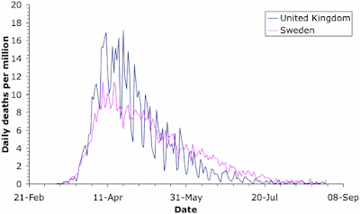
Coronavirus death-rates for Sweden and the UK

For a meaningful comparison, we need to look at the rates, not the raw data, because the two populations are very different in size (Sweden; 10 million, UK: 68 million). These two graphs show the case rate and death rate through time for the two countries. The comparison is quite revealing. [Note: the saw-tooth patterns in the graphs come from the fact that medical reports in most countries are notably fewer on weekends.]

As expected, the cases initially increased faster in Sweden. However, the case rates were very similar in the two countries by the last week of March; and they remained so until Sweden started serious virus-testing in late May. Just at the moment, the case-rates are similar again, although the UK has actually done twice as much virus testing as Sweden (240,000 tests per million people versus 110,000). Anyway, the two different government responses did not produce much difference in the number of cases for the first 3 months of the pandemic.

The death rates show quite a different pattern. The rates started off very similar, but by the end of March the UK actually had a higher death rate than Sweden. This situation was maintained until the end of May, after which Sweden had the higher rate until the end of July. Once again, the two countries are now very similar. Overall, the time-course of deaths is highly correlated between the two countries (79% shared variation), while the case rates are not (7%).

Of particular note here is that the differences in case rates have not resulted in differences in death rates. Apparently, Sweden's voluntary response has allowed a greater proportion of the population to become infected but this has not resulted in more deaths. I am fairly sure that the authorities will attribute this to the development of herd immunity (which I will talk about in my next post on the coronavirus) (WHO expert praises Swedish strategy - urges other countries to follow suit). [Note: a direct comparison with the USA would be pointless, given the geographical variation discussed above.]

The consequences are far-reaching. As but one example of the unfortunate consequences of the UK lock-down, you could read up on the fiasco concerning the final-year school exams (A coronavirus lesson about the modern state) — without a lock-down, Sweden avoided such problems for its young people.

Conclusion

There is a wealth of data in this pandemic, enough to keep data analysts busy for a very long time. I am sure that we will be inundated with reports for many years to come. In the meantime, like all pandemics, the geography of the local epidemics is a vital point in implementing effective control strategies.

Monday, August 24, 2020

Constructing rhyme networks (From rhymes to networks 5)


As is now happening for the summer, this little series on rhyme networks is also coming to its end. We have only two more blog posts to go, with this one discussing the construction of rhyme networks, and then one more post in September, discussing how rhyme networks can be analyzed.

A preliminary annotated collection of rhymed poetry in German

While my original plan was to have all of Goethe's Faust annotated by the end of this series, so that I could illustrate how to make rhyme analyses with a large dataset of rhyme patterns in a language other than Chinese, I now have to admit that this plan was way too ambitious.

Nevertheless, I have managed to assemble a larger collection of German rhymes from various pieces of literature, ranging from boring love poems to recent examples of German Hip-Hop; and all of the rhymes have been manually annotated by myself during recent months.

This little corpus currently consists of 336 German "œuvres" (the data collection itself has more poems and songs from different languages), which make up a total of 1,544 stanzas (deliberately excluding the refrains in songs). There are 3,950 words that rhyme in this collection; and together they occur 5,438 times in a total of 49,797 words written by 72 different authors. The following table summarizes major features of the German part of the database.

Aspect Score
components 994
authors 72
poems 336
stanzas 1544
lines 8340
rhyme words 3950
words rhyming   5438
words total 49797

The whole collection, which is currently available under the working title "AntRhyme: Annotated Rhyme Database", can be inspected online at https://digling.org/rhyant/, but due to copyright restrictions for texts from recent pop songs, not all of the poems can be displayed. In order to share the annotated rhymes along with the initial Python code that I wrote for this post, I have therefore created a version in which only the annotated rhyme words are provided, along with dummy words in which each character was replaced by a miscellaneous symbol. As a result, the song "Griechicher Wein" ("Greek wine") by Udo Jürgens from 1974 now looks as shown in the following figure.


Modeling rhymes with networks

As far as Chinese rhyme networks were concerned, I have always given the impression (and also truly thought this myself) that the reconstruction of a rhyme network is something rather trivial. Given a stanza in a given poem, all one has to do is to model the rhyme words in the stanza as nodes in the network, and then add connections for all of the words that rhyme with each other according to the annotation.

While I still think that this simple rhyme network model is a very good starting point, there are certain non-trivial aspects that one needs to carefully consider when working with this kind of rhyme network. First, there is the question of weighting. In the first study that I devoted to Old Chinese poetry (List 2016), I weighted the nodes by counting their appearance, and I also weighted the edges by first counting how often they occurred. I then normalized this score in order to receive a more balanced weighting. The normalization would first count each rhyme pair only once, even if the same word occurred more than one time in the same stanza, and then apply a formula for normalization based on the number of words rhyming with each other within the same stanza (see ibid. 228 for details).

However, in the meantime, a young scholar Aison Bu has suggested an even better way of counting rhymes, in an email conversation with me. [The pandemic prevented us meeting in person at a conference in early April, so we could never follow this up.] Since rhyming is essentially linear, my original counting of all rhymes that are assigned to the same rhyme partition in a given stanza may essentially be misleading. Instead, Aison suggested counting only adjacent rhymes.

To provide a concrete example, consider the third stanza in the song "Griechischer Wein" by Udo Jürgens (shown above). Here, we have the rhyme group labeled as f, which occurs three times in the data, with the rhyme words Wind (wind), sind (they are), and Kind (child). The normalization procedure that I proposed in the study from 2016 would now construct a network in which all three words rhyme with each other. To normalize the edge weights, each individual edge weight would be modified by the factor 1 / (G-1), where G is the number of rhymes in the rhyme group in the stanza (3 in this case, as we have three words rhyming with each other). Aison's rhyme network construction, however, would only add two edges, one for Wind and sind, and one for sind and Kind, as they immediately follow each other in the verse. A specific normalization of the edge weights would not be needed in this case.

A first rhyme network

Unfortunately, I have not had time so far to test Aison's idea, to draw only edges for adjacent rhymes when constructing rhyme networks. However, with the data for more than 300 German poems and songs assembled, I have had enough time to construct a first and very simple network of German rhyme data.

For this network, I disregarded all normalization issues, and just added an edge for each pair of words that would have been assigned to the same rhyme group in my rhyme annotation. This network resulted in a rather sparse collection of 994 connected components. This is in strong contrast to the Chinese poems I have analyzed in the past (List 2016, List 2020), which were all very close to small-world networks, with one huge connected component, and very few additional components. However, it would be too early to conclude that German rhyme networks are fundamentally different from Chinese ones, given that the data may just be too sparse for this kind of experiment.

At this stage of the analysis, it is therefore important to carefully inspect the networks, in order to explore to what degree the network modeling or the data annotation could be further improved. When looking at the largest connected component, shown in the following figure, for example, it is clear that typical rhyme groups that we would expect to find separated in rhyme dictionaries do cluster together. We find -aut on the left, -aus and -auf on the right, with the word auch (also) as a very central rhyme word, as well as Frau (woman).


While these words can be defended as rhymes, given that they share the diphthong au, we also find some strange matches. Among these is as the cluster with -ut on the bottom left, which links via Mut (courage) to Bauch (belly) and resolut (straightforward). Another example is the link between Frau and trauern (mourn). The former link is due to an annotation error in the poem "Freundesbrief an einen Melancholischen" ("Friendly letter to a melancholic") by Otto Julius Bierbaum (1921), where I wrongly annotated Bauch and auch to rhyme with resolut and Mut.

However, the second example is due to a modeling problem with rhymes that encompass more than one word. This pattern is very frequent in Hip-Hop texts, and I have not yet found a good way of handling it. In the case of Frau rhyming with trauern, the original text rhymes trauern with Frau an, the latter being a part of the sentence "schaut euch diese Frau an" ("look at this woman"). Since my conversion of the text to rhyme networks only considers the first part of multi-word rhymes as the word under question, it obviously mistakenly displays the rhyme, which is also show in its original form in the figure below.


Conclusion

The initial construction of German rhyme networks which I have presented in this post has shown some potential problems in the conversion of rhyme judgments to rhyme networks. First, we have to count with certain errors in the annotation (which seem to be inevitable when doing things manually). Second, certain aspects of the annotation, especially rhymes stretching over more than one word, need to be handled more properly. Third, assuming that poetry is spoken, and spoken texts are realized in linear form, it may be useful to reconsider the current rhyme network construction, by which edges for rhyme examples are added for all possible combinations of rhyme words occuring in the same rhyme group. For the final post in this series next month, I hope that I will find time to address all of these problems in a satisfying way.

References

List, Johann-Mattis (2016) Using network models to analyze Old Chinese rhyme data. Bulletin of Chinese Linguistics 9.2: 218-241.

List, Johann-Mattis (2020) Improving data handling and analysis in the study of rhyme patterns. Cahiers de Linguistique Asie Orientale 49.1: 43-57.

For those of you interested in data and code that I used in this study, you can find them in this GitHub Gist.

Monday, August 17, 2020

Isn't it about time we started behaving rationally in response to Covid-19?


I have written a few blog posts recently about the current Covid-19 pandemic, caused by the arrival of the SARS-CoV-2 virus in our lives. This interests me as a biologist with some background in the study of pathogens (disease-causing organisms).
There have been two extreme responses to the current pandemic. There are all sorts of variants in between, of course, but I will start by characterizing the extremes, and then move on to some practical examples. The point here is that we need a reasoned response to this pandemic, based on the effect of the virus on people, and the make-up of the populations being affected. The current one-size-fits-all approach used by most governments is not going to work, long-term.

The future of having to live with the virus is becoming clearer. Actions can be individual, but they need to be co-ordinated, with each of the risk groups being treated appropriately. Even if you personally feel secure, those around you might experience risks very differently. An all-purpose set of mandated behaviors might work short-term, but we cannot continue to live that way. Behavior needs to make all risk groups feel safe at all times, by being targeted appropriately.


Behaviors

At one extreme, people are trying to hide from the virus. By this, I mean that they are trying to keep away from it. Obviously, many people are doing this individually, but whole countries have also been trying to do it, notably Australia and New Zealand, which are geographically isolated by virtue of being islands. At the other extreme, people are trying to "crush" the virus, like they are playing poker against some weak opponent.

The problem with the first extreme is that you can never come out of hiding, because the virus does not go away, it just sits there (like viruses do) until you finally come past, and then it will get you, after all. This is what the so-called Second Wave of infections is currently showing us. The First Wave of infections occurs because people do not know about the pathogen, and therefore catch it inadvertently. In response to the rapid increase in case rates, people go into self-quarantine, trying to prevent themselves from encountering the virus. This works, but they eventually get tired of doing it, and they come back out again — and that is the Second Wave of infections. It is nothing new as far as the virus is concerned, it simply reflects changing human behavior (out, in, out again).

A prime example of the other extreme is expressed by this recent New York Times article: Here's how to crush the virus until vaccines arrive, or even the Wall Street Journal: The treatment that could crush Covid. You can't crush a pandemic, as we know from the seemingly endless series of previous pandemics in recorded history, and presumably many more of them before we learned to write. Naturally, Wikipedia has a List of epidemics, for you to peruse.

However, at some stage, people are going to have to start treating the current pandemic like the influenza virus — a natural part of their environment, where they take standard precautions to minimize their risk. In response to the perennial threat of flu, old people take vaccines in winter, middle-aged people stay away from public transport during flu season, and young people simply get on with their lives (because a bit of flu will not kill them). These are rational responses, taken by people after evaluating the perceived risk of infection to themselves.

To do this for Covid-19 we need to consider what we have learned so far this year.


We need to learn

During the First Wave of any pandemic we need to over-react, while we find out how the new pathogen behaves and what effects it can have. So, we try everything from social distancing to lock-downs, to see what seems to work in practice. The objective is to reduce the rate of spread of the virus — in biological terms, we are trying to work out what things will flatten the curve (see: Coronavirus: What is 'flattening the curve,' and will it work?).

For example, one current debate is: do face-masks provide protection, in the community setting? They work in hospitals, for sure (Face masks really do matter: the scientific evidence is growing), but that is a specialist environment, where they are used by professionals in conjunction with other methods (hand scrubbing, special clothing, etc). We need to find out whether people can routinely wear face-masks properly, so that the masks do what they are designed to do. We may actually be better off with perspex visors, for example, which are also effective at preventing the spread of breath aerosols (which is the main problem), and they can be worn effectively even by a novice — and they do not make us all look like we are involved in a bank hold-up.

We also need different groups of people to try different approaches, to see how effective they are. If everyone does exactly the same thing, strictly following World Health Organization recommendations for example, then we do not learn much, as a global community. That is, a pandemic is simply a widespread (global) series of epidemics, one in each local area. Since countries are all different, culturally, this cultural diversity creates the ideal environment to maximize learning-by-doing, by treating the pandemic as a set of epidemics, to which we might respond differently.

For example, the Buddhist-dominated communities of South-East Asia have done things in a very community-cooperative manner (these people do not work alone, by choice); and they collectively have the lowest infection rates on the planet. The Muslim-dominated countries of the Middle East do not worry much about life threats (whether they die or not is the Will of Allah), and they collectively have the worst rates. The individual creed of Americans does not encourage them to act co-operatively (resulting in draconian government-mandated lock-downs), and so they also have a very high rate. Sweden is one of the few remaining socialist cultures, where governments give advice rather than issuing instructions (resulting in this case in co-operative self-quarantines), and they have a middling-to-high infection rate.

We learn many things about alternative effective actions from this cultural diversity. In particular, media criticism of the different national reactions to the pandemic is now dying down, as the critics slowly come to realize that uniformity always results in an all-or-none outcome.


What have we learned?

Okay, so after the First Wave we know that this new virus can do everything from: apparently nothing (there are plenty of people with antibodies who have never felt any symptoms of having had the virus), to creating flu-like symptoms (key symptoms: fever, cough, skin rash, loss of taste & smell), on to hospitalization (with usually c. 7 days to get rid of the symptoms but 5 weeks to get rid of the actual virus), or even intensive care (as a result of what is medically called a cytokine storm). For the elderly, and others with pre-existing medical conditions, the virus seems to be one thing too many for their body, the proverbial straw that breaks the camel's back — which can lead to death sooner rather than later.

So, not only does SARS-CoV-2 infection not mean death for the vast majority of people (globally, < 3.6% of reported infections have resulted in death), it does not even necessarily mean sickness at all (eg. a Swedish study showed that 46% of those study people with antibodies had never reported clinical symptoms). This should mean something for our future responses.

Notably, in those countries where a significant Second Wave is now occurring, the new infections are often not resulting in deaths (except notably in Australia). This is a very important difference between the First and Second Waves, in most places. There is speculation that the SARS-CoV-2 variants currently widespread are less deadly than were those common at the beginning of the pandemic; but it is equally likely that those people who were most susceptible to the virus have already succumbed during the First Wave.

So, we now know about the risk groups, roughly, which is as good as we ever know such things; and we have a good idea about the outcomes of the various risks. This means we can start to do some reasoned things, as a pandemic response. The Second Wave is a perfect time to start treating the Covid-19 situation rationally.


The time for some new action?

This means that it is time to start targeting actions to the degree of risk for each person, rather than having over-arching actions that affect everyone equally. Our individual responses to the virus are not equal, so why are most government actions still predicated on the idea that we are all equal?

The point is, we have to respond to what we have learned about relative risks. For example, I have argued before that the biggest mistake Sweden has made was letting Covid-19 get into the aged-care facilities, which is where most of the country's deaths have now occurred. Has anyone learned from this mistake? Apparently not in the USA: Untested for Covid-19, nursing-home inspectors move through facilities. Come on people — get your act together.

The response to the First Wave always needs to assume equality, because anything else would be irresponsible, in the face of our initial ignorance. During the Second Wave, however, we are no longer quite so ignorant, and we can tailor our actions to suit the conditions. When are we going to start doing this?

In order to think about this question, it is worthwhile to consider a few topics that seem to be on the agenda, and look at some practical examples of three relevant situations.


Trying to hide

Any country that successfully hides from the virus has to keep hiding, forever. New Zealand has recently been crowing about having gone 100 days without a new coronavirus case. That record was destroyed this week (New Zealand on alert after 4 cases of COVID-19 emerge from unknown source); and it will get even worse on the day they allow the first visitor into their country. Their current Alert Level 3 response cannot change this — you cannot hide from a virus.

New Zealand's near neighbor, Australia, has demonstrated this point even more strongly. In one sense, the Australians understand quarantine, because it is a big part of keeping plant and animal diseases out of their country. For example, international visitors are regularly surprised to have biological products (notably wood) confiscated at the arrival airport — better safe than sorry.

So, dealing with Covid-19 should be straightforward for them — you just apply the same idea to the people, themselves. Sadly, it took them some time to realize that you have to take people straight from the airport to a quarantine hotel, if the quarantine strategy is to work. One of my nephews returned to Sydney (Australia) from Copenhagen (Denmark) at the beginning of the First Wave, and he had to make his own long way by public transport from the airport to the quarantine house that his father had arranged!

So, it should not be a surprise that quarantine has not been effective everywhere in Australia — one mistake is all it takes. This mistake was made in the quarantine hotels in Melbourne (Victoria), where the quarantine security turned out to be a joke (see: New coronavirus lockdown Melbourne amid sex, lies, quarantine hotel scandal). Perhaps the security guards should have read the earlier article on: Sex in the time of coronavirus.

The issue here is that Australians are no better than Americans at following government instructions — individual rights take precedence (see: Individual choice is a bad fit for Covid safety). Even my local newspaper here in Uppsala (Sweden) reported (Regel brott ger böter) the news that military personnel were sent to visit 3,000 Australians who were supposed to be in self-quarantine at home (due to having tested positive for the virus), and 800 of them (one-quarter!) were not at  home. I lived in Australia for 40 years, and this situation surprises me not at all.

So, hiding does not work, long-term, because you have to keep it up for too long to be practical for most people. The Second Wave in Victoria is actually worse than the First Wave, in terms of number of Covid-19 cases. The ensuing lock-down is now even worse than it has been in most other places (see: 'Very dead': army and police patrol the deserted streets of coronavirus-stricken Melbourne); and Victoria itself has been quarantined from the rest of the country.


Schools

We have all been told that the effect of Covid-19 is age-related; and the global data shows that this is true everywhere — the older you are, the more likely you are to seriously affected. One outcome of this knowledge is that actions can be tailored to age groups. Notably, we can consider the idea that massively disrupting the lives of very young people may be doing more them harm than good, due to stress if nothing else (Lockdowns and school shutdowns may make youngsters sicker).

Most countries mandated the closure of schools, and instituted some form of working from home for the pupils. This move was predicated on the idea that children will catch the virus in the crowded schools, and bring the disease home to their elders. This scenario seemed to be the case, for example, in the early spread of the SARS-CoV-2 in northern Italy.

Recent evidence, however, suggests that, while the youngsters do catch the virus, they are much less infectious than older people (see: COVID-19 study confirms low transmission in educational settings). We are talking about pre-teenagers here, not older children. This does not mean that they can't spread the virus (see: Latest research points to children carrying, transmitting coronavirus), but merely that this is a much lower risk.

It has therefore been suggested that a rational response would involve a trade-off between disrupting the lives of very young people versus the risk of viral spread (see: Why it’s (mostly) safe to reopen the schools). Notably, this issue was explicitly considered in Sweden, and during the First Wave it was decided to keep the junior schools open, but to close the senior schools (ie. high school). So, the younger children have all been trundling off to school every week-day, just as usual, the whole time. As far as I know, there has not been even one reported outbreak involving any of the open schools.

This is why I emphasize the importance of culturally diverse responses to a pandemic. In this case, the Swedes seem to have got it right; and everyone else could learn from this.


Young people

It is a different matter for somewhat older (but still young) people. The so-called Millennial generation has had a pretty tough time, especially financially. This is the second financial down-turn that they have experienced in a dozen years, just when they are trying to get themselves onto their own two feet (see: Millennials slammed by second financial crisis fall even further behind).

So, none of us should be surprised that these people are thoroughly sick of restrictive pandemic responses by now. Indeed, it is becoming widespread news that case rates are increasing among 20-29 year olds (or 15-25, depending on how people are grouped) (see: WHO urges young people to help control the spread of coronavirus). This has become particularly obvious in Europe (see: Coronavirus cases rise in Europe as youth hit beaches and bars), but also in North America (see: B.C. hospitalizations, deaths steady as latest wave hits mostly young people) and Australia (see: Coronavirus Australia: Why young people are spreading COVID-19).

This is not necessarily as bad as it might sound, because the effect of the virus is age-related, and these people will probably mostly be safe (but not all). The same thing is true for somewhat younger people — youth is a social time, and mandated restrictions about distancing may not be very effective (see: Why the teenage brain pushes young people to ignore virus restrictions).

Places like Japan and Spain are now cracking down on bars, and the like (eg. Spain cracks down on outdoor drinking, smoking in renewed push against COVID-19). If you want some survey data on what activities U.S. people currently feel comfortable doing, then check out: Weekly updates on consumers’ comfort level with various pastimes.

In this situation, Sweden has not been exempted; and recent coronavirus cases have become prevalent in the 20-29 year old group, just like elsewhere else. Once again, this emphasizes that our knowledge cannot all come from one place. No-one gets it all right, but they may get some things right; and we should learn from both success and failure. This is the rational approach, not the one-size-fits-all approach.

Adding to this scenario, as I write this blog post, Europe is having a warm spell (up to 40 °C in the south), and my local newspaper has the headline: Chaos on Europe's beaches in the heatwave. All governments are warning about the need to continue keeping people apart, for those who wish to avoid infection. Fortunately, the summer holidays are nearing their end in the northern hemisphere.


Concluding comments

From the biological perspective, for the future to be bearable, we need to reach herd immunity, which refers to public safety in the presence of a pathogen. This is determined by the proportion of the (local) population that needs to become immunized (either by becoming infected or by being vaccinated) in order for the infection to stop spreading (see: A new understanding of herd immunity).

We can achieve herd immunity by responding rationally based on the make-up of the population, in terms of the relative risks. At-risk groups need to be protected, while the rest of the people get on with their lives. For example, Stockholm, in Sweden may now be getting close to herd immunity (or flock immunity, as the locals would call it), the Swedes having foregone the lock-downs imposed elsewhere, and thus allowing immunity to arise naturally.

Herd immunity can be achieved without rationality, of course — we simply wait for the weakest people to die, and the rest are likely to be safe. You might not like the moral implications of doing this, but it is biologically effective, nonetheless. For example, India may potentially end up with the world's worst case-rate for infections, given its population size and large degree of poverty in many areas (where social distancing is not feasible). However, its saving grace, in terms of deaths, may well be the consequent fact that poor people are usually young, because poor people do not live long in the first place. Herd immunity to SARS-CoV-2 is easy to achieve under these circumstances (see: Herd immunity seems to be developing in Mumbai’s poorest areas).

I vote for the rational approach, myself, among the many biological alternatives.

Monday, August 10, 2020

Fossils and networks 2 – deleting (and adding) one tip


A general assumption in phylogenetics is: the more the better. The more data my matrix includes, the better will be my tree. The more taxa I include, the better will be my phylogenetic analysis. But is this true when we include (or rely on) fossils? After all, there is an old saying: less is more; and in this post I will show you that it is often true here, too.

Perfect data – how to recognize unproblematic topologies

In the first post of this series (Farris and Felsenstein), I introduced two matrices, a Farris Zone matrix and a Felsenstein Zone matrix, with the same set of tip taxa: three extant genera and three early fossils, one for each generic lineage.

The Farris Zone matrix provides a perfect signal. No matter which inference criterion one uses, one always gets the true tree. In such a case, the taxon sampling should be irrelevant; and it is. Any 5-taxon sub-tree correctly shows only splits found in the 6-taxon true tree — shown below are the actual most parsimonious trees (MPT) of each inference using the branch-and-bound algorithm.

Six most-parsimonious trees showing the topology of the true tree; trees are midpoint-rooted and have the same scale.
Note: NJ/LS and ML would give the same result for this experiment.

Consequently, for the perfect case, the SuperNetwork of the six 5-taxon trees is the 6-taxon true tree.

Z-closure SuperNetwork (Huson et al. 2004) of the 5-taxon MPTs generated with SplitsTree (walkthrough at the end of the post) depicting the true tree.

Therefore, the simplest test to check for potential topological issues in any set of data is to sub-sample the taxa by sequentially pruning a single taxon, infer the resulting group of trees (which I will call minus-one trees), and then summarize this tree sample in the form of a SuperNetwork. If the data have no signal issues – and the inferred all-inclusive tree is unbiased – all minus-one trees will be congruent with the all-inclusive inferred tree. The resulting SuperNetwork will then be a tree matching the inferred all-inclusive tree.

On the other hand, if removing a single taxon has a significant effect on the inferred tree, then this either means you need this taxon to get the right tree or that this taxon is causing bias. We cannot assume that trees with many taxa are better than trees with fewer taxa. Only if a topology is independent of taxon sampling can we be sure that we are looking at a true tree (or one inevitable with the data at hand).

Taxon-sampling matters? Then the all-inclusive tree may be biased

Real data matrices are far from perfect. Paleophylogenetic matrices, for instance, not only include a lot of missing data limiting the decision capacity of any phylogenetic inference, but, being restricted to morphological traits, usually high levels of homoplasy — that is, similarity in conflict or only partial agreement with the phylogeny (here are some related posts: Has homoiology been neglected in phylogeny? Should we bother about character dependency? Please stop using cladograms! The curious case[s] of tree-like matrices with no synapomorphies and More non-treelike data forced into trees: a glimpse into the dinosaurs). While some OTUs are primitive in their character suites, others are highly derived. We often, without realizing it, are infering within or close to the Felsenstein Zone.

If we repeat the same minus-one experiment, but now use the Felsenstein Zone matrix, instead, we end up with something quite different. We get three most-parsimonious tree (MPT) solutions when eliminating the outgroup genus O or its fossil Z; and eliminating the genera A and B and their fossils C and D, respectively, each leads to a single MPT. This yields a total of 10 MPTs.

First row rooted with Z, all other trees mid-point rooted. All trees have the same scale.

By pruning the long-branching genera A or B, even parsimony analysis gets the correct tree because we have eliminated the source of the long-branch attraction. Adding fossils to break down long branches can be effective (classic paper: Wiens 2005), but dropping long-branching tip taxa works just as well. Changing between a close outgroup (fossil Z) and a distant outgroup (fossil O) has little benefit here.

In this case, the resulting SuperNetwork of our 10 MPTs is not a tree but a network including alternative clades, wrong ones (orange), ie. not monophyletic, and correct ones (green) — ie. branches (internodes, bipartitions) reflecting the monophyletic lineages of the true tree.

Comprehensive Z-closure SuperNetwork of the 10 minus-one MPT inferred based on the Felsenstein Zone matrix. The network includes all split patterns found in the MPT sample.

A real world example

To give an example of how sequentially dropping one taxon works with real-world data, we'll use the exhaustive 700 character matrix for bird-related dinosaurs provided by Hartman et al. (2019).

With its total of 501 taxa (OTUs), the apparent rationale behind the matrix is that, by including as many taxa as possible, one gets the best-possible (parsimony) trees, irrespective of the signal quality provided by individual OTUs. However, the full matrix cannot be forced into a single-optimal parsimony tree, due to missing data (72% of the matrix' cells are undefined or ambiguous, ie. 255969 cells) and a scarcity of synapomorphies (in a Hennigian sense) — this is discussed in Hartman et al.; see also the related Q&A.

Here, in light of the computational effort and to avoid heuristics when searching the MPTs, we'll use a pruned sub-matrix. For our first experiment, we take 15 out of the 19 best-covered OTUs. Thus, OTU pairs / triplets that are much more similar to each other than to any other OTU, are reduced to the best-covered representative.

The 19-taxon matrix that I used in a previous post (Large morphomatrices – trivial signal) had only one most-parsimonious tree solution, showing only clades in agreement with current opinion, which assumes a largely staircase-like evolution from dinosaurs to modern birds (Tree of Life). In contrast to the full matrix, the 19-taxon matrix provided high support for most clades (method-independent), reflecting the number of scored traits. The extant taxa, representatives of modern birds (duck, turkey and ostrich, all edible), have many derived cgaracters, with the extinct bird genus Lithornis being placed in-between ostrich and duck + turkey.

The optimal topologies for the 19 best-covered taxon matrix. Green, the single most-parsimonious tree. Clade names copied from Wikipedia/Tree of Life.

The ML and NJ/LS (except for one branch) trees were topologically identical; each branch is supported by about 100 inferred changes. The signal from the matrix should be straightforward.

The tree-size weighted mean (default in SplitsTree) SuperNetwork, summarizing the result of an exhaustive branch-and-bound search using the 15-dropped-1-taxon matrices (each one resulting in a single optimal MPT) has a tree-like structure.

Allosaurus-rooted SuperNetwork of the 15 minus-one MPTs. Green – clades also found in the all-inclusive tree representing monophyla; orange – conflicting clades, blue – the all-inclusive tree doesn't resolve the assumed monophyly of modern birds, but places Lithornis as sister to Neognathae.

Conflicting clades are found in only two of the 15 inferred MPTs, being represented by short branches (their length in the other 14 trees is counted as zero).

Nonetheless, these conflicts received considerable character support. The frequency of a split in the minus-1 tree sample is irrelevant (see the A-B LBA problem discussed above — any tree including A and B showed the wrong clade). When summarizing our tree sample (especially when using MPTs), we should hence opt for a SuperNetwork, in which the edge lengths give the minimum branch lengths found in the MPT collection, ie. the edge length reflects the minimum length of the branch in all trees showing that branch.

Same SuperNetwork as above, but using the "Min" option instead of the default setting for computing edge lengths.

Without Dromiceiomimus – representing an earlier diverged lineage and step in bird evolution – the Dromaeosauridae clade, which is probably monophyletic (Wikipedia), flips and dissolves into a grade. By removing the intermediate step, we seem to create some ingroup-outgroup (long-branch) attraction.

Anas, the duck, forms the morphological link to Lithornis – with a mean morphological pairwise Hamming distance (MD) of 0.23, Anas is the most-similar OTU; and, hence, the MPT places Lithornis as sister to Anas + Meleagris (turkey; MD = 0.17). By eliminating Anas, the remaining contemporary birds form a clade — the modern birds (Neornithes) are assumed to be monophyletic but do not form a clade in the all-inclusive MPT (Struthio, the ostrich, is morphologically more distant from duck, turkey and Lithornis).

Conclusion

Even the most comprehensive, least gappy of paleophylogenetic matrices have substantial signal issues. If a tree inference is dependent on which OTUs are sampled, we cannot assume that we will automatically get better trees simply by including everything we have. Some OTUs (in our experiment: Dromiceiomimus) will stabilize correct aspects of a tree, while others will manifest bias or error (here: Anas). It's unlikely that a wrong, ie. not monophyletic, clade created by the attraction of two well-sampled taxa can be broken down by adding numerous taxa showing only a fraction of defined characters. SuperNetworks of minus-one trees can point you to the critical OTUs and unstable branching patterns of your (backbone) phylogeny.

PS. Personally, I would analyze a matrix with these properties, and a taxon sample spanning more than 150 myrs of evolution (from Allosaurus to modern birds), using ML not MP. I used MP in this post only because paleontologists are still very fond of it (not a few still discard anything else as unfit for their data). ML is less prone to long-branch attraction, results in a single tree (easier to compare when using larger taxon samples), and is speedy these days, allowing for more in-depth experiments towards the end of the exploratory data analysis. Both IQ-Tree (homepage; includes links to online servers) and RAxML-NG (open access paper providing essential links / github; implemented on various online servers) can quickly infer ML trees and establish branch support (including but not restricted to nonparametric bootstrapping) using binary and multistate data.


Walk-through for computing Z-closure SuperNetworks (Huson et al. 2004) in SplitsTree (v. 4, since v. 5 is still not fully functional):
  1. Make sure the tree sample for reading is in Newick format, including branch-length information. The trees can be in a single file or multiple files.
  2. Start SplitsTree.
  3. To read in the tree sample:
    • File > Open, if your trees are in one file;
    • File > Tools > Load multiple trees, if your files (eg. minus-1 MPTs) are in different files.
  4. Go to Networks > SuperNetwork. Choose "Min" for "Edge Weight" in the pop-up analysis window for the first graph. You can also try out "Mean"/"Sum" (short, rare alternatives will be less prominent), "AverageRelative" (trade-off) or "None" (branch-lengths in the minus-one tree sample are ignored). When using simple tree samples (little topological variation, matrix with fairly stringent signals), a single run (default) suffices. Increasing the number (eg. to 100) ensures no branching pattern in the minus-one tree sample gets lost. For instance, for the Felsenstein Zone matrix, a single run will give you a SuperNetwork capturing the major conflicting aspects, while 100 runs will lead to a higher dimensional graph that includes the correct BD and AC clades as alternatives. If you like to view the overall best-fitting tree instead of a network, tick "SuperTree".


Cited papers

Hartman​ S, Mortimer M, Wahl WR, Lomax DR, Lippincott J, Lovelace DM (2019) A new paravian dinosaur from the Late Jurassic of North America supports a late acquisition of avian flight. PeerJ 7: e7247.

Huson DH, Dezulian T, Kloepper T, Steel MA (2004) Phylogenetic super-networks from partial trees. IEEE/ACM Transactions on Computational Biology and Bioinformatics 1: 151–158.


Wiens JJ (2005) Can incomplete taxa rescue phylogenetic analyses from long-branch attraction? Systematic Biology 54: 731–742.

Monday, August 3, 2020

Coronavirus statistics are (almost) all misleading


There are plenty of places on the internet where we can access statistics about the current Covid-19 pandemic, caused by the rapid global spread of the SARS-CoV-2 virus — notably Johns Hopkins University (formally described here), and Worldometer. These are compilations of official government statistics, comparing different countries, or states within a country. These are potentially interesting, because we can see how things are progressing in our own location, and compare it to other places. If nothing else, this might inform our own actions for protecting ourselves.

The basic problem is that these data are often not comparable between jurisdictions, in the sense that they will have been collected in different ways and with different degrees of success. For example, consider these two recent articles about the country that is very likely to end up being the worst hit:
The second one contains this quote that sums up the issue: "India is the third-worst hit country in the world, but there are concerns a lack of testing could mean the true figure is far higher." Government organizations usually do their best to collate their local data, but their relative success in a situation like this will vary from "okay" to "abysmal". We cannot really know where any given dataset fits into that continuum, and this profoundly affects how we interpret the data.

ourworldindata.org/coronavirus

Data must be comparable if we are to compare them. This is an obvious truism, especially in science; but achieving comparability is often very difficult in practice, and scientists spend much of their time trying to achieve it in their own work. I would hate to be the person delegated the job of summarizing this pandemic globally, because they will really be us against the wall. But someone will have a go at it, believe me, and I wish them every success.

In this post, I summarize the main data-collecting issues, as they are currently understood. The two main statistics reported are the number of infection cases and the number of resulting deaths, which have separate issues.

Case numbers

Deciding whether a particular person is a Covid-19 case is not straightforward. Three main criteria have been used to date:
  • disease symptoms (which are similar to influenza)
  • detection of a viral genome in the body (meaning the person currently has the virus)
  • detection of virus antibodies in the body (meaning the person has previously had the virus).
These three criteria will yield different estimates of the number of cases.

Since the virus seems to have originated in China, the Chinese were the first to officially count cases. They started by including only those people who had been tested for the virus itself (after they showed symptoms), but soon realized that this caused a delay before these people received medical treatment. So, the official data show a massive spike in case numbers, when the authorities switched to using symptoms alone to count cases. You can see in this graph (from Worldometer) which day that was.

Coronavirus cases in China

Using symptoms alone presumably over-estimates the number of cases, because of the similarity of coronavirus symptoms to those resulting from influenza viruses. Clearly, symptoms need to be confirmed by a direct test for each particular type of virus.

However, without a concerted testing effort for SARS-CoV-2, the number of cases will be under-estimated, probably by a large margin. We now know that many people show few or no symptoms of this coronavirus, and will therefore not be detected if we test only those people with explicit symptoms, and who visit a testing center. Some countries have made massive testing efforts, relative to their population size, while many other countries have been much less active. This table shows the top data from Worldometer, counted as the number of tests per million people.

Coronavirus testing per million people

Clearly, the more of your population you test, the more likely you are to correctly detect all of your cases. The effect of this can be seen in this next Worldometer graph, for Sweden. The apparent burst in cases after June 5 was due to the government finally implementing large-scale virus testing, which naturally increases the detection rate for this type of situation. That is, the data were greatly under-estimated before June 5, and the official data were corrected during June, by catching up with many of the as-yet-undetected cases. This increased testing has continued, which means that the drop in cases during July is cause for optimism, as in any situation where you search for something bad and don't find it. Nevertheless, these tests cover only 8% of the population, to date, and so even now the data may still (theoretically) be under-estimates.

Coronavirus cases in Sweden

So, between-country comparisons are misleading, unless the same amount of virus testing has been conducted. This is the point I made about India, above, where testing is a real challenge given the size of the population. Those of you in the USA might like to contemplate just how many cases you really have — your officials have conducted more tests than anyone else except China, but you still have covered only 17% of your population (the table above is cut off at 30% coverage).

Alternatively, antibody testing is a good way to detect people who have had the virus without knowing it, since this studies their body's reaction to the virus rather than looking for the virus itself. As this sort of testing proceeds around the world, the number of official cases will continue to increase. However, the number of false positives and false negatives of the antibody tests means that even they are not entirely reliable (see False positive and false negative coronavirus test results explained). Indeed, a review article assessing the range of currently available antibody tests shows remarkable variation in their success rates (Diagnostic accuracy of serological tests for Covid-19: systematic review and meta-analysis).

As a final point, which has been very obvious here in Sweden, is just how long a person is considered to be a Covid-19 case. As far as Sweden is concerned, there were apparently a lot of "active cases" early in the pandemic. However, what was happening was that most other jurisdictions were declaring cases as "recovered" after the person's symptoms receded, which takes about 7 days, and were then removed from the official list of cases. On the other hand, Sweden did not officially declare a case recovered until the person was completely free of the virus, which takes about 5 weeks. So, Sweden's reported number of active cases remained much higher than for most other places, for a much longer time. The number of Swedish cases was actively criticized by the foreign media, but the cause was never mentioned — the data were not comparable to elsewhere.

Similarly, the reporting of cases is obviously not equal throughout any given week, so that daily reports are unreliable — there are obvious weekly cycles in almost all of the national datasets, with fewer reported cases or deaths on Saturdays and Sundays. The same thing applies to regional (geographic) patterns, of course. For example, both Spain and the United Kingdom have noted that their current outbreaks are all regional, with the majority of their countries being much less affected.

Coronavirus test results

Number of deaths

This brings us a consideration of counting deaths due to Covid-19. We all know what death is, but it is not so easy to assign a particular cause to any particular death. A death certificate signed by a professional medical practitioner will assign an official "cause of death", and possibly list other "contributing factors". So, when does a death count as a coronavirus death?

The simplest solution is to say that any dead person who has a virus genome in their body counts; and it is clear that some of the statistics around the world have counted Covid-19 deaths this way. Unfortunately, as has been pointed out ironically, this counts people who are carrying the virus when they get run over by a car; and this may not be what most people mean when referring to "a coronavirus death".

Just as importantly, some jurisdictions have clearly tested, and thus counted, only those people who died in hospital. Similarly, there are clear differences in counting due to social circumstances, especially in countries with large poor communities. These factors will under-estimate the actual death rate.

The main issue, however, is that most of the people severely affected by this new virus are elderly persons with pre-existing medical conditions. For example, 7.3% of the reported Covid-19 cases in Sweden have resulted in death, to date, but 89.1% of those deaths have been in the 70+ age group. This is a bit more extreme than elsewhere, as early on in the pandemic the virus got into several aged-care facilities in Sweden. In most of these cases, the SARS-CoV-2 virus was simply one thing too many, for people whose health was already declining — this is called co-morbidity (the presence of one or more additional conditions co-occurring with a primary medical condition).

So, where is the border between a main cause and a subsidiary factor? The answer to this question clearly differs around the world; and this makes the officially reported death data non-comparable. Some data will be over-estimates and some will be under-estimates, compared to some global standard definition. So, what does the following graph, from Worldometer, really tell us?

Reported coronavirus deaths gloabally

The generally accepted solution to this conundrum is to consider what is called excess mortality, which assumes that there has been a temporary change in the number of deaths during some specified period of time. That is, we do not assign deaths to particular causes, but simply compare the total number of deaths now to the total number of deaths in previous years. The difference can be attributed directly or indirectly to the current circumstances. This is not perfect, but it is the best we have got.

So, we should compare the number of deaths during the current pandemic period with some estimate of a baseline number of deaths under more normal circumstances. The baseline is commonly taken as the equivalent data from the immediately preceding 3–5 years, or so — how many more people have died during the pandemic, compared to the average deaths during the same months of prior years?

The U.S. Centers for Disease Control and Prevention has a compilation of these data for the states of the USA, updated daily: Excess deaths associated with COVID-19. The data are still provisional, but it would be nice to think that they are directly comparable. Whether the data are actually meaningful for the current pandemic is a point I discuss at the end of this post.

Similarly, the EuroMOMO collaborative network is supported by the European Centre for Disease Prevention and Control, and provides weekly data for public health threats in 24 European countries. If you look at their graphs, you can see the age-related effects of seasonal flu in every winter since 2016, as well as the magnitude of current pandemic. Here is a graph of their current data, pooled across all age groups and countries. Roughly speaking, deaths are 80% greater than in previous years.

Excess mortality in Europe since 2016

Elsewhere in the world, data are a bit more scarce. The principal problem is lack of suitable prior data — not everywhere on the planet has accurate estimates of the local death rate, for some combination of social, economic or political reasons. Nevertheless, we have data for all of the expected places; and some of the groups who are collating the excess mortality data for the current pandemic are listed by the Our World in Data site: Excess mortality from the coronavirus pandemic (COVID-19).

These groups include three newspapers, each of which is covering the current pandemic across c. 10 countries:
All three of these make their compiled data publicly available on GitHub.

Conclusion and final point

The world is a complex place, and biology is one of the most complex parts of it. Do not over-interpret simplistic data, no matter how prettily it is presented. In particular, for data to be meaningful, all parts of it need to be directly comparable; otherwise the conclusions are likely to be wonky.

Sadly, as a final point to emphasize the issues, I will note that the USA itself apparently has rather big practical problems, as discussed in: Covid-19 data in the US is an ‘information catastrophe’. According to this media report, there are serious problems with the hospitalization data:
Covid-19 data in the US — in fact, almost all public health data — is chaotic: not one pipe, but a tangle ... Every health system, every public health department, every jurisdiction really has their own ways of going about things ... It's very difficult to get an accurate and timely and geographically resolved picture of what's happening in the US, because there's such a jumble of data.
The issue seems to be the National Healthcare Safety Network, as used by the Centers for Disease Control and Prevention, which is responsible for collating the data nationally. The Department of Health and Human Services has now taken over direct responsibility for data concerning Covid-19 infections in hospitalized patients, much to the dismay of many people.