Pages

Wednesday, February 25, 2015

Three years of network blogging


Today is the third anniversary of starting this blog, and this is post number 325. Thanks to all of our visitors over the past three years — we hope that the next year will be as productive as this past one has been.

I have summarized here some of the accumulated data, in order to document at least some of the productivity.

As of this morning, there have been 238,613 pageviews, with a median of 192 per day. The blog has continued to grow in popularity, with a median of 70 pageviews per day in the first year, 189 per day in the second year, and 353 per day in the third year. The range of pageviews was 172-1148 per day during this past year. The daily pattern for the three years is shown in the first graph.

Line graph of the number of pageviews through time, up to today.
The largest values are off the graph. The green line is the half-way mark.
The inset shows the mean (blue) and standard deviation of the daily number of pageviews.

There are a few general patterns in the data, the most obvious one being the day of the week, as shown in the inset of the above graph. The posts have usually been on Mondays and Wednesdays, and these two days have had the greatest mean number of pageviews.

Some of the more obvious dips include times such as Christmas - New Year; and the biggest peaks are associated with mentions of particular blog posts on popular sites.

Unfortunately, the data are also seriously skewed by visits from troll sites. These have been particularly from the Ukraine, which is solely responsible for the peak between days 900 and 1000. The smaller following peak represents visits from Taiwan.

The posts themselves have varied greatly in popularity, as shown in the next graph. It is actually a bit tricky to assign pageviews to particular posts, because visits to the blog's homepage are not attributed by the counter to any specific post. Since the current two posts are the ones that appear on the homepage, these posts are under-counted until they move off the homepage, (after which they can be accessed only by a direct visit to their own pages, and thus always get counted). On average, 30% of the blog's pageviews are to the homepage, rather than to a specific post page, and so there is considerable under-counting.

Scatterplot of post pageviews through time, up to last week; the line is the median.
Note the log scale, and that the values are under-counted (see the text).

It is good to note that the most popular posts were scattered throughout the years. Keeping in mind the initial under-counting, the top collection of posts (with counted pageviews) have been:
129
42
172
10
181
73
58
188
146
98
49
29
8
The Music Genome Project is no such thing
Charles Darwin's unpublished tree sketches
The acoustics of the Sydney Opera House
Why do we still use trees for the dog genealogy?
How do we interpret a rooted haplotype network?
Carnival of Evolution, Number 52
Who published the first phylogenetic tree?
Phylogenetics with SpongeBob
Charles Darwin's family pedigree network
Faux phylogenies
Evolutionary trees: old wine in new bottles?
Network analysis of scotch whiskies
Tattoo Monday
8,347
5,271
5,052
3,954
3,644
2,398
2,077
2,037
2,011
1,951
1,870
1,756
1,747
This list is not very different to the same time last year. Posts 129 (which is linked in Wikipedia) and 172 continue to receive visitors almost every day.

The audience for the blog continues to be firmly in the USA. Based on the number of pageviews, the visitor data are:
United States
France
Ukraine [spurious]
Germany
United Kingdom
Russia
Canada
Australia
China
Turkey
40.3%
6.8%
5.1%
5.0%
4.7%
3.1%
1.8%
1.6%
1.0%
0.7%

Finally, if anyone wants to contribute, then we welcome guest bloggers. This is a good forum to try out all of your half-baked ideas, in order to get some feedback, as well as to raise issues that have not yet received any discussion in the literature. If nothing else, it is a good place to be dogmatic without interference from a referee!

Monday, February 23, 2015

Darwin's Finches, genomics and phylogenetic networks


As a means of motivating his interest in speciation, in The Origin of Species Charles Darwin highlighted the diversity of morphological forms among the finches of the Galápagos Islands, in the south-eastern Pacific Ocean, which he visited while circumnavigating the world in The Beagle. He considered this to be a prime example of biodiversity related to adaptation and natural selection, what we would now call an adaptive radiation.

Recently, the following paper, which provides a genomic-scale study of these birds, has attracted considerable attention:
Lamichhaney S, Berglund J, Almén MS, Maqbool K, Grabherr M, Martinez-Barrio A, Promerová M, Rubin CJ, Wang C, Zamani N, Grant BR, Grant PR, Webster MT, Andersson L (205) Evolution of Darwin's finches and their beaks revealed by genome sequencing. Nature 58: 371-375.
The authors note:
Darwin's finches are a classic example of a young adaptive radiation. They have diversified in beak sizes and shapes, feeding habits and diets in adapting to different food resources. The radiation is entirely intact, unlike most other radiations, none of the species having become extinct as a result of human activities.
Here we report results from whole genome re-sequencing of 120 individuals representing all Darwin's finch species and two closely related tanagers. For some species we collected samples from multiple islands. We comprehensively analyse patterns of intra- and inter-specific genome diversity and phylogenetic relationships among species. We find widespread evidence of inter-specific gene flow that may have enhanced evolutionary diversification throughout phylogeny, and report the discovery of a locus with a major effect on beak shape.
Sadly, the authors try to study the intra- and inter-specific variation principally using phylogenetic trees. They do this in spite of noting that:
Extensive sharing of genetic variation among populations was evident, particularly among ground and tree finches, with almost no fixed differences between species in each group.
Clearly, this situation requires a phylogenetic network for adequate study, as a network can always display at least as much phylogenetic information as a tree, and usually considerably more. The authors do recognize this:
A network constructed from autosomal genome sequences indicates conflicting signals in the internal branches of ground and tree finches that may reflect incomplete lineage sorting and/or gene flow ... We used PLINK to calculate genetic distance (on the basis of proportion of alleles identical by state) for all pairs of individuals separately for autosomes and the Z chromosome. We used the neighbour-net method of SplitsTree4 to compute the phylogenetic network from genetic distances.
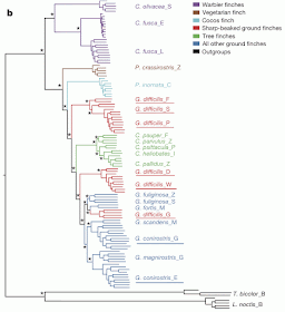
However, this network is tucked away as Fig. 3 in the appendices. It is shown here in the first figure. The authors attribute the gene flow to introgression, but occasionally refer to hybridization and convergent evolution. Indeed, they suggest both relatively recent hybridization as well as the possibility of more ancient hybridization between warbler finches and other finches.


Clearly, this network is not particularly tree-like in places, especially with respect to the delimitation of species based on their morphology, as reflected in their current taxonomy. Nevertheless, the authors prefer to present as their main result as a:
maximum-likelihood phylogenetic tree based on autosomal genome sequences ... We used FastTree to infer approximately maximum-likelihood phylogenies with standard parameters for nucleotide alignments of variable positions in the data set. FastTree computes local support values with the Shimodaira–Hasegawa test.
This tree is shown in the second figure.


This apparently well-supported tree is not a particularly accurate representation of the pattern shown by the network. Indeed, it makes clear just why it is inadequate to use a tree to study the interplay of intra- and inter-specific variation. Gene flow requires a network for accurate representation, not a tree.

The authors do acknowledge this situation. While they try to date the nodes on their tree, they do note that:
Although these estimates are based on whole-genome data, they should be considered minimum times, as they do not take into account gene flow.
Actually, in the face of gene flow the concept that a node has a specific date is illogical, because the nodes do not represent discrete events (see Representing macro- and micro-evolution in a network). Given the authors' final conclusion, it seems quite inappropriate to rely on trees rather than networks:
Evidence of introgressive hybridization, which has been documented as a contemporary process, is found throughout the radiation. Hybridization has given rise to species of mixed ancestry, in the past and the present. It has influenced the evolution of a key phenotypic trait: beak shape ... The degree of continuity between historical and contemporary evolution is unexpected because introgressive hybridization plays no part in traditional accounts of adaptive radiations of animals.

Wednesday, February 18, 2015

Representing macro- and micro-evolution in a network


In biology we often distinguish microevolutionary events, which occur at the population level, from macroevolutionary events, which involve species. We have traditionally treated phylogenetics as a study of macroevolution. However, more recently there has been a trend to include population-level events, such as incomplete lineage sorting and introgression.


This is of particular importance for the resulting display diagrams. A phylogenetic tree was originally conceived to represent macroevolution. For example, speciation and extinction occur as single events at particular times, and these events apply to discrete groups of organisms. The taxa can be represented as distinct lineages in a tree graph, and the events by having these lineages stop or branch in the graph.

This idea is easily extended to phylogenetic networks, where the gene-flow events are also treated as singular, so that hybridization or horizontal gene transfer can be represented as single reticulations among the lineages.

These are sometimes called "pulse" events. However, there are also "press" events that are ongoing. That is, a lot of genetic variation is generated where populations repeatedly mix, so that every gene-flow instance is part of a continuous process of mixing. This often occurs, for example, in the context of isolation by distance, such as ring species or clinal variation. Under these circumstances, processes like introgression and HGT can involve ongoing events.

For instance, in an earlier life I once studied three species of plant in the Sydney region (Morrison DA, McDonald M, Bankoff P, Quirico P, Mackay D. 1994. Reproductive isolation mechanisms among four closely-related species of Conospermum (Proteaceae). Botanical Journal of the Linnean Society 116: 13-31). One of the species was ecologically isolated from the other two (it occurred in dry rather than damp habitats), and the other two were geographically isolated from each other (they occurred on separate sandstone uplands with a large valley in between). These species look very different from each other, as shown in the picture above, but looks are deceiving. Where the ecological isolation was incomplete, introgression occurred and admixed populations could be found.

These dynamics are more difficult to represent in a phylogenetic tree or network. We do not have discrete groups that can be represented by lines on a graph, but instead have fuzzy groups with indistinct boundaries. Furthermore, we do not have discrete events, but instead have ongoing (repeated) processes.

Nevertheless, it seems clear that there is a desire in modern biology to integrate macroevolutionary and microevolutionary dynamics in a single network diagram. That is, some parts of the diagram will represent pulse events involving discrete groups and other parts will represent press events among fuzzy groups. This situation seems to be currently addressed by practitioners by first creating a tree to represent the pulse events (and possibly their times), and then adding imprecisely located dashed lines as a representation of ongoing gene flow — see the example in Producing trees from datasets with gene flow. This particular mixture of precision and imprecision seems rather unsatisfactory.

Perhaps someone might like to have a think about this aspect of phylogenetic networks, to see if there is some way we can do better.

Monday, February 16, 2015

An Hennigian analysis of the Eukaryotae


As usual at the beginning of the week, this blog presents something in a lighter vein.

Homologies lie at the heart of phylogenetic analysis. They express the historical relationships among the characters, rather than the historical relationships of the taxa. As such, homology assessment is the first step of a phylogenetic analysis, while building a tree or network is the second step.

With a colleague (Mike Crisp, now retired), I once wrote a tongue-in-cheek article about how to mis-interpret homologies, and the consequences of this for any subsequent tree-building analysis. This article appeared in 1989 in the Australian Systematic Botany Society Newsletter 60: 24–26. Since this issue of the Newsletter is not online, presumably no-one has read this article since then. However, you should read it, and so I have linked to a PDF copy [1.2 MB] of the paper:
An Hennigian analysis of the Eukaryotae


Wednesday, February 11, 2015

Producing trees from datasets with gene flow


Recently, a number of computer programs have been released that are intended to produce phylogenetic networks representing introgression (or admixture) (see Admixture graphs – evolutionary networks for population biology).

A recent example of the use of these programs is presented by:
Jónsson H, Schubert M, Seguin-Orlando A, Ginolhac A, Petersen L, Fumagalli M, Albrechtsen A, Petersen B, Korneliussen TS, Vilstrup JT, Lear T, Myka JL, Lundquist J, Miller DC, Alfarhan AH, Alquraishi SA, Al-Rasheid KA, Stagegaard J, Strauss G, Bertelsen MF, Sicheritz-Ponten T, Antczak DF, Bailey E, Nielsen R, Willerslev E, Orlando L (2014) Speciation with gene flow in equids despite extensive chromosomal plasticity. Proceedings of the National Academy of Sciences of the USA 111: 18655-18660.
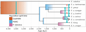
This study presents a phylogenetic analysis of the extant genomes of the genus Equus, the horses, asses and zebras. This analysis leads the authors to the conclusion that there is "evidence for gene flow involving three contemporary equine species despite chromosomal numbers varying from 16 pairs to 31 pairs." The gene flow is indicated by the light-blue reticulations in the first diagram.


One important issue with these types of analyses is the logic on which the procedure is based. Programs like TreeMIx (used in this analysis) were developed to allow modelling of gene flow across the branches of trees at a microevolutionary (population) scale. Specifically, the graph generated by TreeMix models singular (pulse) introgression events in phylogenetic history.

The issue is that a tree is produced first, and then reticulations are added to it. The tree represents descent and the reticulations represent gene flow. But how do we produce a tree from a dataset that contains evidence of both descent and gene flow? The authors' initial tree is shown below.


The procedural logic works as follows:
(i) we assume that the traditionally recognized species exist
(ii) we assume that we have a representative sample of them, with one genome each
(iii) we construct a tree based on the assumption that there is no gene flow among the species
(iv) we then assess the species for gene flow, and discover it.

Isn't this rather circular? Surely (iv) invalidates the assumptions inherent in (i)-(iii)? How can we then assess the reliability of the sampling in (ii) and the analyses in (iii)? Why have we made assumption (i)? At best the species are fuzzy groups to one extent or another, and we do not know where we have sampled within the probabilistic space assigned to the groups.

This seems like a very poor way to go about studying the interaction between descent and gene flow. First we assume descent only, and then we assess gene flow. When we find gene flow we continue to accept the results of the initial analyses based on descent alone.

I would hate to have to justify this philosophy to someone outside phylogenetics, because I have a horrible feeling that they would either smile tolerantly or laugh outright.

This between-species situation is even more extreme for those within-species patterns where groups are recognized. Human races and domesticated breeds are two concepts that have received constant criticism. Neither races nor breeds form clear-cut groups, as there are no sharp boundaries between them, due to gene flow. Their "central locations" in genotype space are usually very different, however. Therefore it is quite possible to perform a tree-based analysis of samples from the central locations, and this would tell us a lot about descent. But it would tell us almost nothing about gene flow; and we would have a very distorted view of the phylogenetic history.

Monday, February 9, 2015

A network analysis of pizza styles


Over the past century a number of food styles have become internationalized, including hamburgers and fried chicken. Not all of these foodstuffs are nutritious, and some people have noted that not all of them are even particularly edible. However, perhaps the most interesting of these foods is the venerable pizza, not least because the customer has considerable say in what it looks and tastes like, but also because it is made and cooked fresh, right in front of us.


Pizza originated in Italy, Greece, or Persia, depending on how we define pizza. After all, covering flat bread with a topping is an idea that goes back a very long way. In the ancient world, the Egyptians made flat bread; the Indians baked bread in an oven, but without a topping; and the Persians cooked their bread without an oven, but they did put melted cheese on it. The Passion 4 Pizza site notes this more recent history: "The ancient Greeks had a flat bread called plakountos, on which they placed various toppings [eg. herbs, onion and garlic], and we know also that Naples was founded (as Neopolis) by the Greeks; and Naples is the home of the modern pizza."

In 16th century Naples, a yeast-based flat bread was referred to as a pizza, eaten by poor people as a street food; but the idea that led to modern pizza was the use of tomato as a topping. Tomatoes were introduced to Europe from South America in the 16th century, and by the 18th century it was common for the poor of the area around Naples to add tomato to their bread. Pizza was brought to the United States by the Italian immigrants in the late 19th century, and became popular in places like New York and Chicago.

Kenji López-Alt publishes The Pizza Lab, which is part of the Serious Eats blog, and he has taken a serious interest in pizza styles, at least in New York. He recognizes three main styles of pizza, based on their dough, the way it is treated, and the temperature at which it is cooked (see the picture above, left to right):
  • New York
  • Sicilian
  • Neapolitan
He also has several variants on these styles.

As a basis for discussion, I have analyzed the dough ingredients of these three styles, using a phylogenetic network as a tool for exploratory data analysis. To create the network, I first calculated the similarity of the pizzas using the Manhattan distance, and a Neighbor-net analysis was then used to display the between-dough similarities as a phylogenetic network. So, pizza-dough styles that are closely connected in the network are similar to each other based on their ingredients, and those that are further apart are progressively more different from each other.


The Neapolitan-style dough is the simplest in terms of ingredients. The dough is not kneaded, but instead is allowed to rise for 3-5 days in the refrigerator, although it remains a thin-crust pizza. It is cooked quickly at a high temperature. The New York-style dough is an offshoot of this that is slightly thicker, and is cooked cooler and slower. The unkneaded dough stands in the fridge for only 1 day. Like all of the styles except the Neapolitan, olive oil is used in the dough, but unlike any of the others it also contains sugar (to help the crust brown more evenly). The Sicilian-style dough is intended for a thick-crust pizza. It requires only a little kneading, after which it is allowed to rise for 2 hours at room temperature. It is essentially fried in olive oil while baking.

The Sfincione is the original Sicilian pizza style, thinner and chewier than the New York Sicilian. It is also cooked at a lower temperature. The Deep Pan pizza is, of course, another thick-crust style. It is allowed to rise for longer than the Sicilian, and is cooked at a higher temperature. The network shows that these all have closely related doughs.

The Greek-style pizza is allegedly a style "found mostly in the 'Pizza Houses' and 'Houses of Pizza' in New England". As shown by the reticulation in the network, it has characteristics of the Neapolitan pizza dough (relatively low water content) and the Sicilian (relatively high oil content). It is left to rise at room temperature overnight, and is cooked like the New York and Deep Pan pizzas.

There are many other pizza styles, of course, but I do not have recipes for them. For example, there is another Deep Dish style found in Chicago.

Wednesday, February 4, 2015

Do biologists over-interpret computer simulations?


Computer simulations are an important part of phylogenetics, not least because people use them to evaluate analytical methods, for example for alignment strategies or network and tree-building algorithms.

For this reason, biologists often seem to expect that there is some close connection between simulation "experiments" and the performance of data-analysis methods in phylogenetics, and yet the experimental results often have little to say about the methods' performance with empirical data.

There are two reasons for the disconnection between simulations and reality, the first of which is tolerably well known. This is that simulations are based on a mathematical model, and the world isn't (in spite of the well-known comment from James Jeans that "God is a mathematician"). Models are simplifications of the world with certain specified characteristics and assumptions. Perhaps the most egregious assumption is that variation associated with the model involves independent and identically distributed (IID) random variables. For example, simulation studies of molecular sequences make the IID assumption, by generating substitutions and indels at random in the simulated sequences (called stochastic modeling). This IID assumption is rarely true, and therefore simulated sequences deviate strongly from real sequences, where variation occurs distinctly non-randomly and non-independently, both in space and time.


The second problem with simulations seems to be less well understood. This is that they are not intended to tell you anything about which data-analysis method is best. Instead, whatever analysis method matches the simulation model most closely will almost always do best, irrespective of any characteristics of the model.

To take a statistical example, consider assessing the t-test versus the Mann-Whitney test — this is the simplest form of statistical analysis, comparing two groups of data. If we simulate the data using a normal probability distribution, then we know a priori that the t-test will do best, because its assumptions perfectly match the model. What the simulation will tell us is how well the t-test does under perfect conditions; and indeed we find that its success is 100%. Furthermore, the Mann-Whitney test scores about 95%, which is pretty good. But we know a priori that it will do worse than the t-test; what we want to know is how much worse. All of this tells us nothing about which test we should use. It only tells us which method most closely matches the simulation model, and how close it gets to perfection. If we change the simulation model to one where we do not know a priori which analysis method is closest (eg. a lognormal distribution), then the simulation will tell us which it is.

This is what mathematicians intended simulations for — to compare methods relative to the models for which they were designed, and to deviations from those models. So, simulations evaluate models as much as methods. They will mainly tell you which model assumptions are important for your chosen analysis method. To continue the example, non-normality matters for the t-test when the null hypothesis being tested is true, but not when it is false. Instead, inequality of variances matters for the t-test when the null hypothesis is false. This is easily demonstrated using simulations, as it also is for the Mann-Whitney test. But does it tell you whether to use t-tests or Mann-Whitney tests?

This is not a criticism of simulations as such, because mathematicians are interested in the behaviour of their methods, such as their consistency, efficiency, power, and robustness. Simulations help with all of these things. Instead it is a criticism of the way simulations are used (or interpreted) by biologists. Biologists want to know about "accuracy" and about which method to use. Simulations were never intended for this.

To take a first phylogenetic example. People simulate sequence data under likelihood models, and then note that maximum likelihood tree-building does better than parsimony. Maximum likelihood matches the model better than parsimony, so we know a priori that it will do better. What we learn is how well maximum likelihood does under perfect conditions (it is some way short of 100%) and how well parsimony does relative to maximum likelihood.

As a second example, we might simulate sequence-alignment data with the gaps in multiples of three nucleotides. We then discover that an alignment method that puts gaps in multiples of three does better than ones that allow any size of gap. So what? We know a priori which method matches the model. What we don't know is how well it does (it is not 100%), and how close to it the other methods will get. But this is all we learn. We learn nothing about which method we should use.

So, it seems to me that biologists often over-interpret computer simulations. They are tempted to over-interpret the results and not see them for what they are, which is simply an exploration of one set of models versus other models within the specified simulation framework. The results have little to say about the data-analysis methods' performance with empirical data in phylogenetics.

Monday, February 2, 2015

Tattoo Monday XI


Here is a new collection of interesting tattoos.

For other examples of circular trees see Tattoo Monday, Tattoo Monday V and Tattoo Monday VII. For circular trees with pictures see Tattoo Monday II, and for DNA trees see Tattoo Monday IV. For other March of Progress tattoos see Tattoo Monday VIII.